The AIGA Design Census:
The Future of Design
Data Visualization / Visual Design / Print
Overview
Looking at data collected in the AIGA Design Census, particularly those concerning "the future of design," my team and I created a series of cards to explain the data. As a team, we explored color, patterns, and typography as a means of data visualization.
Role
I was a Visual Designer. I helped create the visual concept and style.
Teammates
I worked with Deborah Lee, Steven Ji, Albert Yang, and Jessie Headrick.
Duration
The project lasted about 2 months.
Outcomes
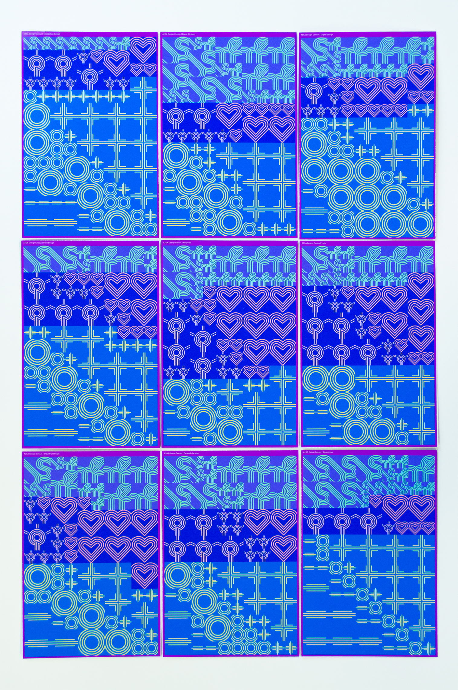
The final product is 9 cards representing 9 design industries' views of the future of design, and a card deck to house the cards. This project was a Regional Winner in the 2017 Print Regional Design Annual
Final Pieces
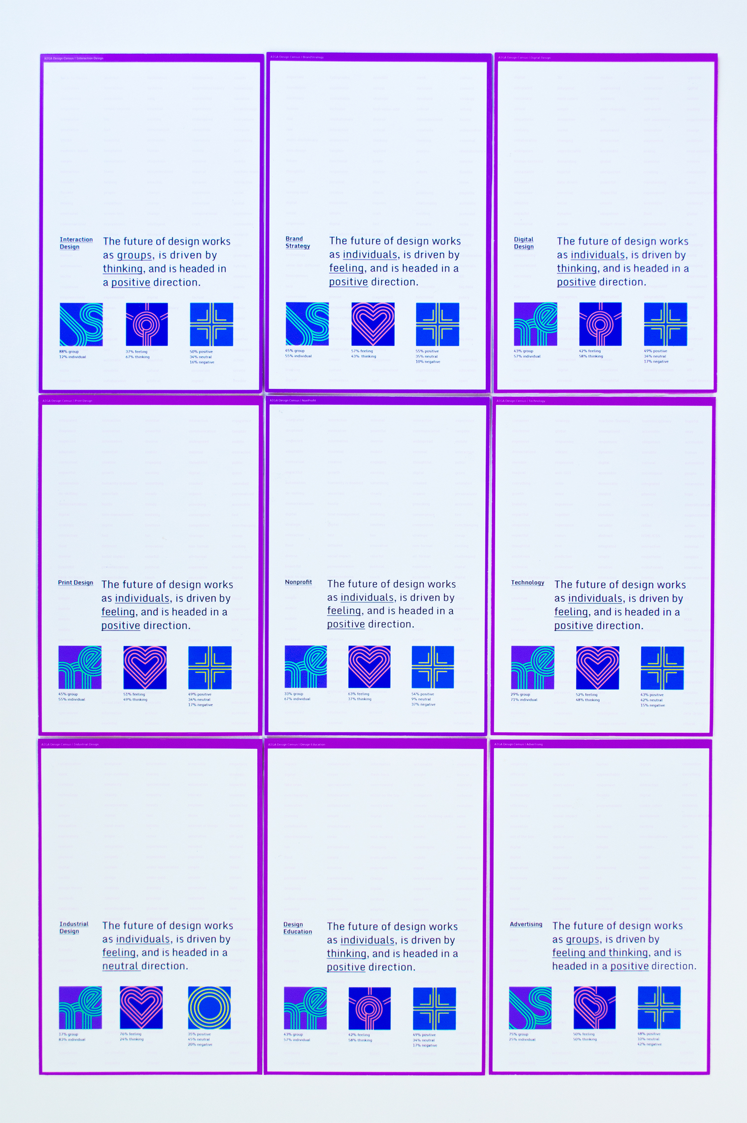
In the AIGA Design Census, every participating designer chose 3 words to describe what they perceive the future of design to be. We took the first 50 entries from each industry and compared the 150 words (3 words x 50 designers per industry.) From there, we categorized the words by whether they describe the Designer, Method, or Product of the future. There is a second level of categorization from there that specifies the meaning of the entry: Designer (Group or Individual?), Method(Thinking or Feeling?), Product (Positive, Negative, or Neutral?) On each card, 1/150 of the grid represents one word. By looking at our cards, you will see our final visualizations and be able to compare between the different industries’ views of the future of design.
We used data collected by the AIGA Design Census. We decided to focus on the words that different industries use to describe the future of design.
The Categorizing Algorithm
Words are more difficult to quantify than than numbers so we had to come up with our own algorithm for categorizing. Eventually, we landed on designer, product, and method, with a second level of categorization after. A lot of it was subjective and up to us. But, we were also able to use a sentiment analysis for measuring whether the words designers used to describe their outlook were positive, negative, or neutral.
Visual Concept
We found that a blend of icons and typography could be used to indicate the different levels of categorization. This was our first sketch and inspired our final design.
The thing we would struggle with throughout our design process was finding the right balance of abstract and representative. When we got to this point, we were content with where it was on this scale but really needed to iterate on the aesthetics.
The Initial Pattern
This was what we showed at our first critique. We found that it was really busy because we were layering typography and icons. We needed to simplify to only one layer and find a way to blend the typography and icons.
Also, the use of color was not yet cohesive. The top left, for example, has the wrong color contrast. We also had to many shades of color.
Cleaning Up the Pattern
We iterated on tones, icons, and types of color contrasts. With 5 people in one group, we sent the file back and forth to each other, moving things around, and assisting each other with the production work it took to finalize these cards.
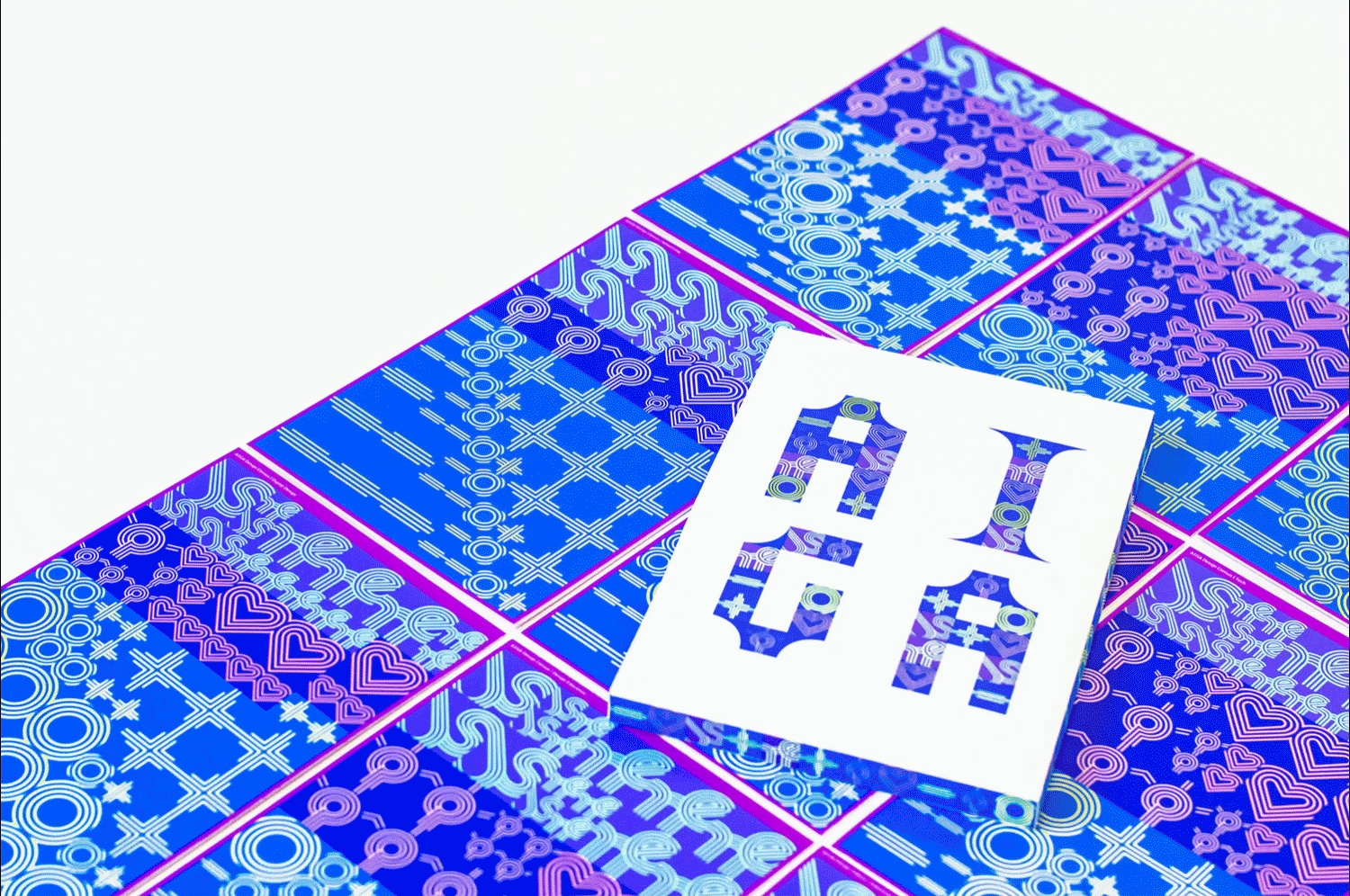
Card Deck
The card deck was something I explored independently. I integrated the icons, but distributed them randomly. The typography of "AIGA" follows the grid of the cards yet introduces the curve into the letters to add formality to the letters.