Book Covers
Illustration / Art Direction
Overview
This was a self-initiated exploration of book cover design across 10 different genres. After receiving the Carnegie Mellon Marilyn Meltzer Award for Excellence in Color, I used the funding for the books, printing new covers, and an exhibition showcasing final works.
Duration
This study lasted a year.
Outcome
I displayed the final books in the Frame Gallery at Carnegie Mellon University.
Redesigning covers for 10 book genres
I chose 10 books that I wanted to read from 10 different genres that I felt could use a new cover. I created new concepts to visualize the books, and explored color as a driving visual element in each.
Final Book Covers
Gallery Show
The covers were displayed alongside the original covers in the Carnegie Mellon Frame Gallery.
Redesigned Covers
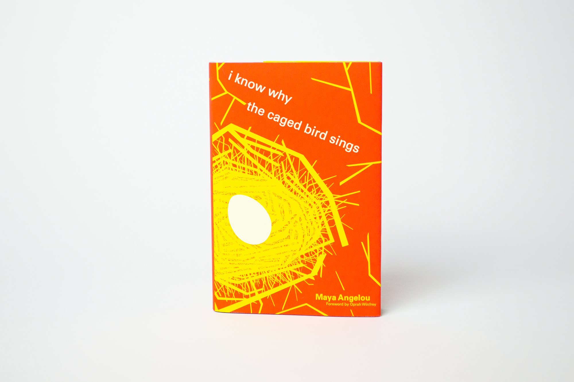
Memoir: I Know Why the Caged Bird Sings
Original Cover.
For this cover, I chose warm colors inspired by the warm, Southern setting of Stamps, Arkansas. The original cover used similar colors plus a black and featured the silhouette of a bird. I thought this worked well but wanted to bring up the saturation so that it would be more eye catching.
I stuck with the silhouette style but drew a nest to visualize the childhood and vulnerability conveyed in the story. I crafted the nest in such a way that it also looked like a cage. I show an "egg" rather than a fully grown bird because this is a coming-of-age story, unlike some of Maya Angelou's other stories which chronicle her older life.
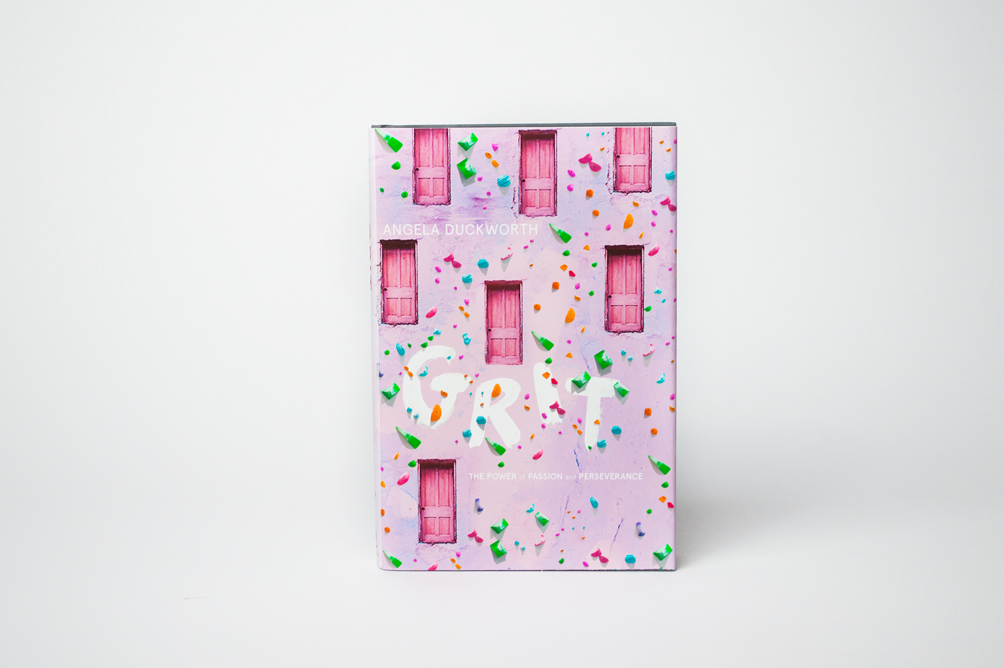
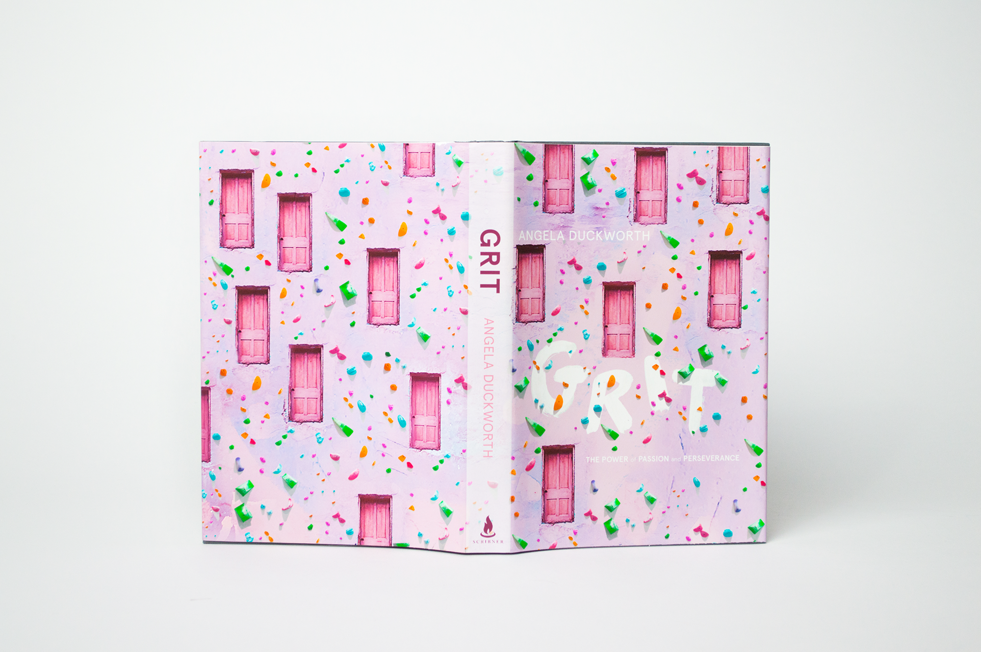
Self-Help: Grit
Original Cover.
The book, Grit, is about how the most important trait for success is not talent, but rather, passion and perseverance. It focuses primarily on educational growth and achievement in children. I paired pink with primary colors to give a child-like palette to the cover.
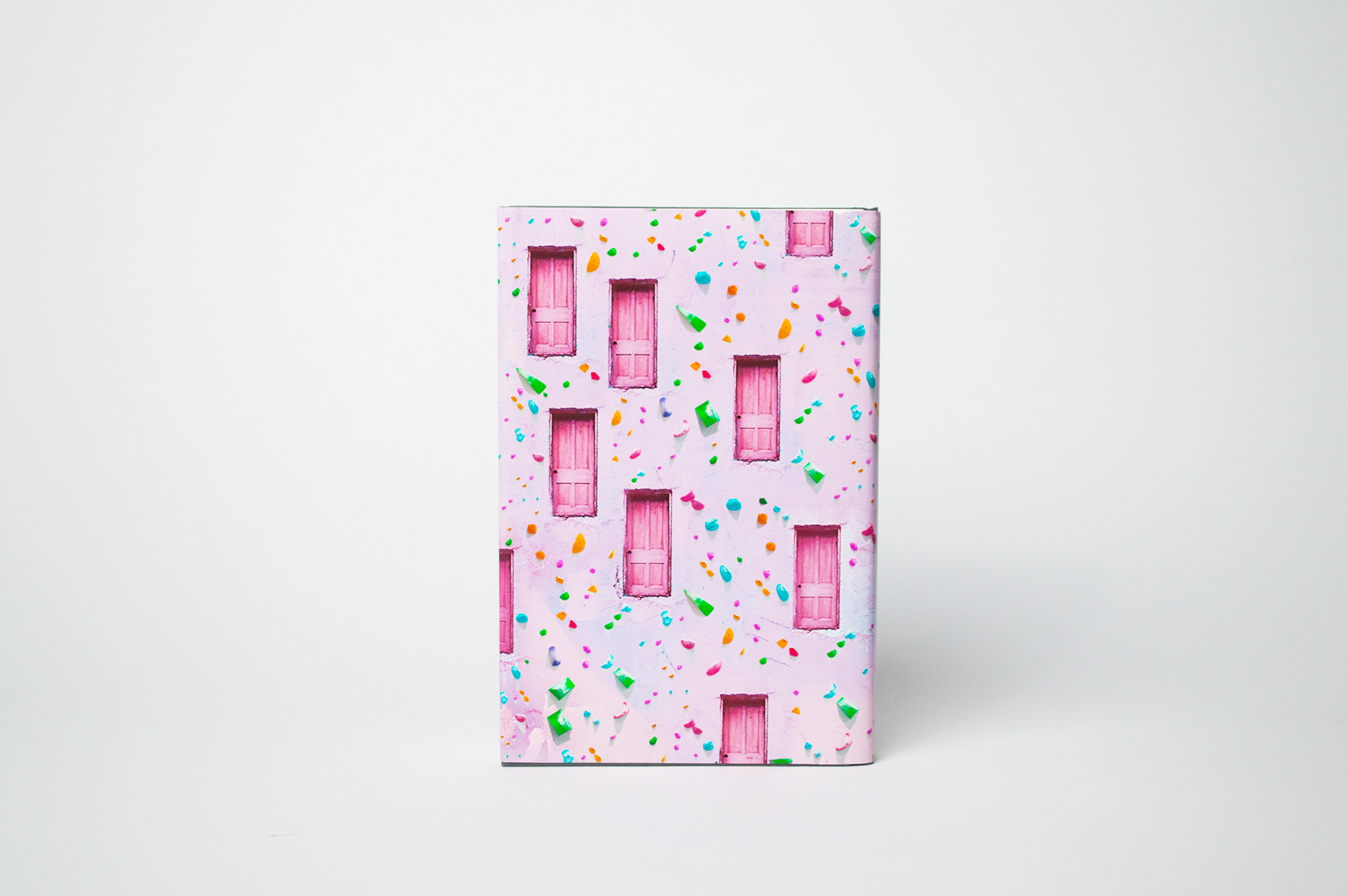
This cover was inspired by a real home that I encountered in Over-the-Rhine, a neighborhood in Cincinnati, Ohio. On the front of this home, there was one door, located on the second story of the home, rather than the first. Doors are often used to represent opportunities. I thought it was very significant and symbolic how hard the door was to reach and enter through.
For the design, I created a climbing wall, something considered universally to be challenging. This perception is common with adults, who read the book. Climbing is also a common activity for children, who are a focus of the book. Climbing the wall leads to different doors of opportunity. It just requires grit to get to them. Since the book is also about achieving high, the doors also are representative of hierarchy; the doors/opportunities at the top are harder to get to than those that are below.
Psychology: Hallucinations
Original Cover.
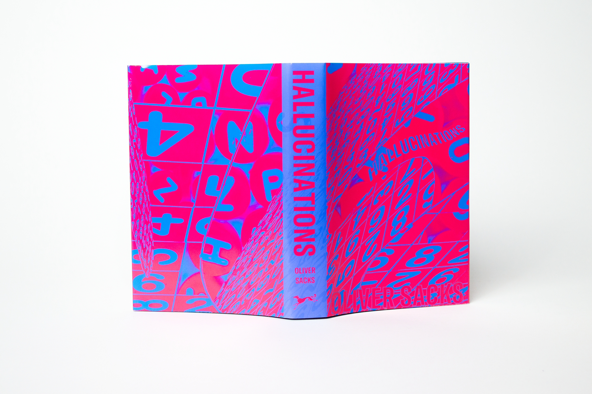
Hallucinations is a neurologists' documentation and observations of hallucinations, both of patients and personal experiences.
I chose colors that vibrate, because my goal was to create an uncomfortable visual effect that was similar to a hallucination.
Science Fiction: The Hitchhiker's Guide to the Galaxy
Original Cover.
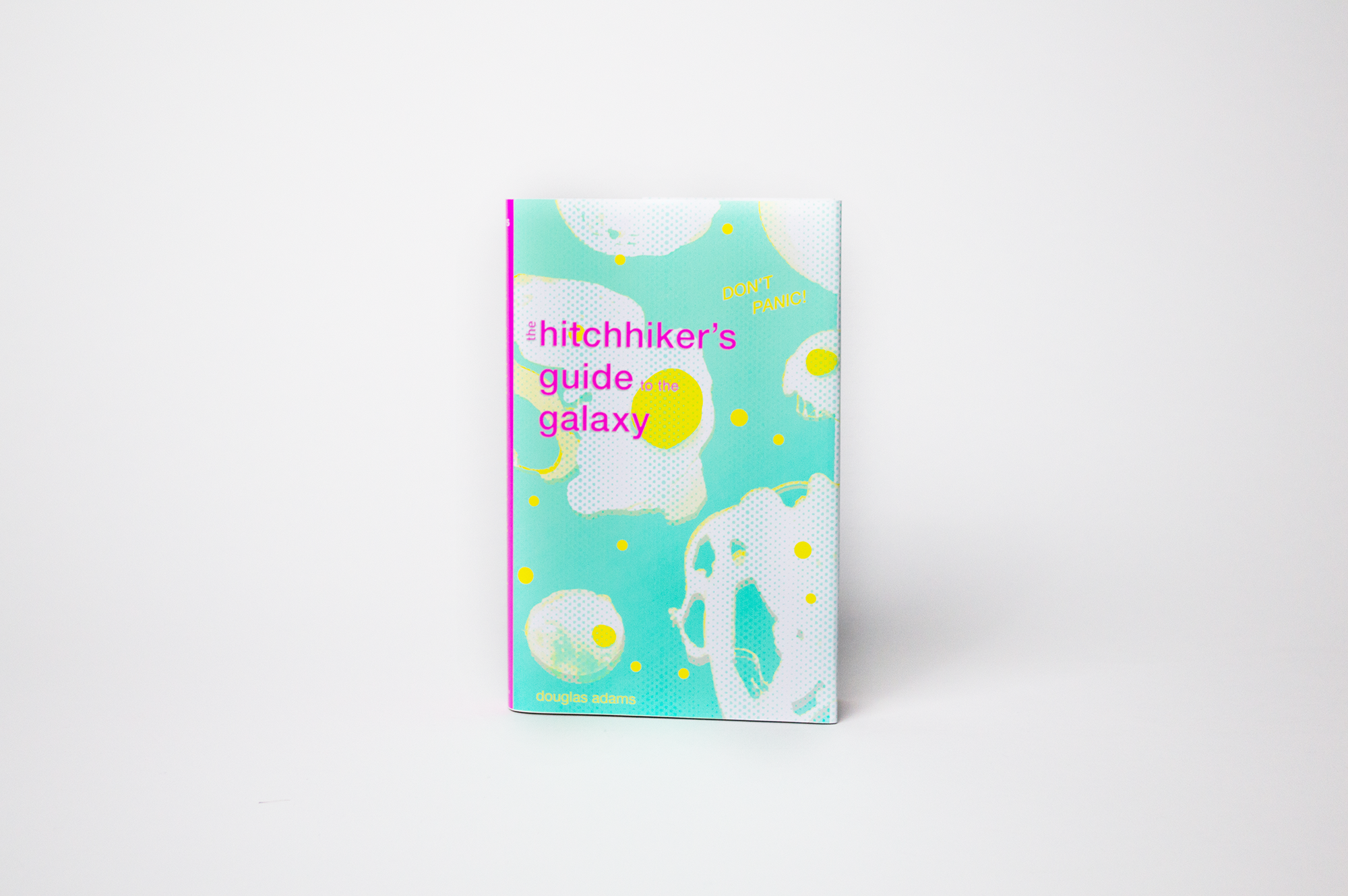
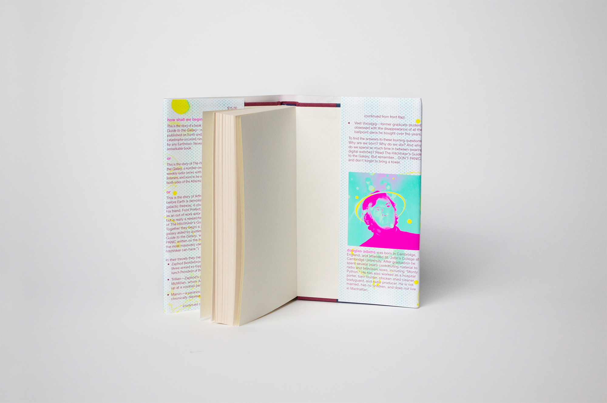
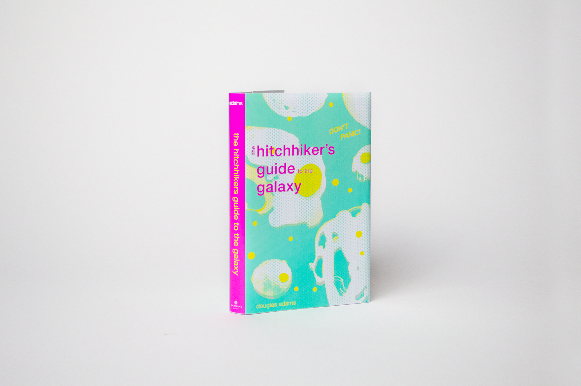
For the cover of Hitchhikers Guide, I visualized a moment of the book when their ship crashes. In this disastrous moment, eggs are floating in outer space. I thought this was pretty representative of a lot of the book: chaos and absurdity. I photographed eggs that I made into a pattern for the cover of this book to represent this moment in the story. I chose typography that felt technical, since the actual Hitchhikers Guide in the book is a digital interface.
Realistic Fiction: Infinite Jest
Original Cover.
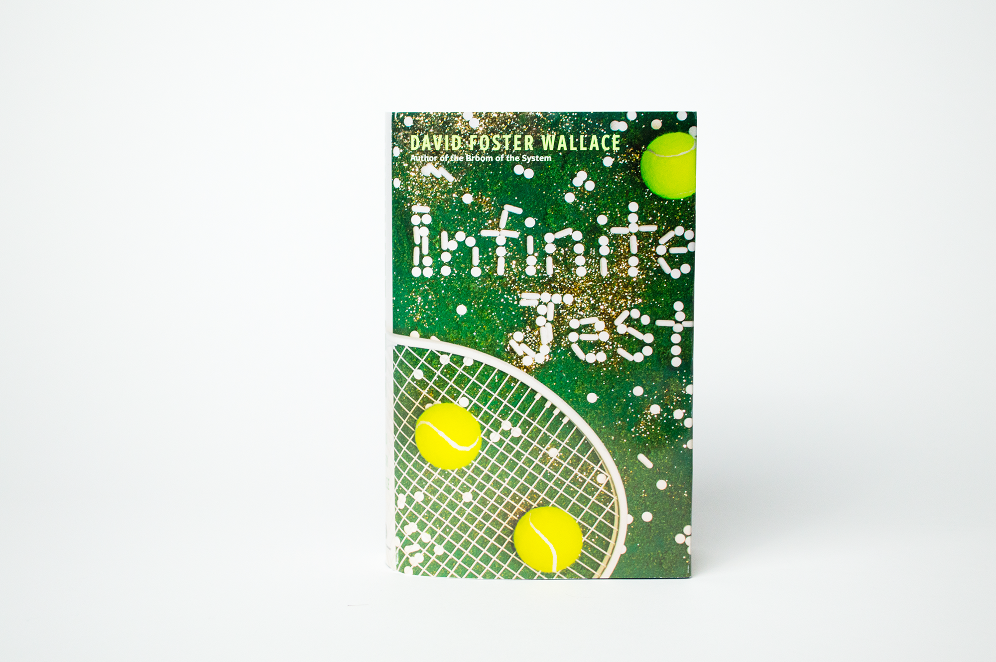
Classified as an "encyclopedic novel," Infinite Jest is over a thousand pages of hard-to-follow plot-lines and character development. For the design, the composition is as chaotic as the intertwined narratives of the book.
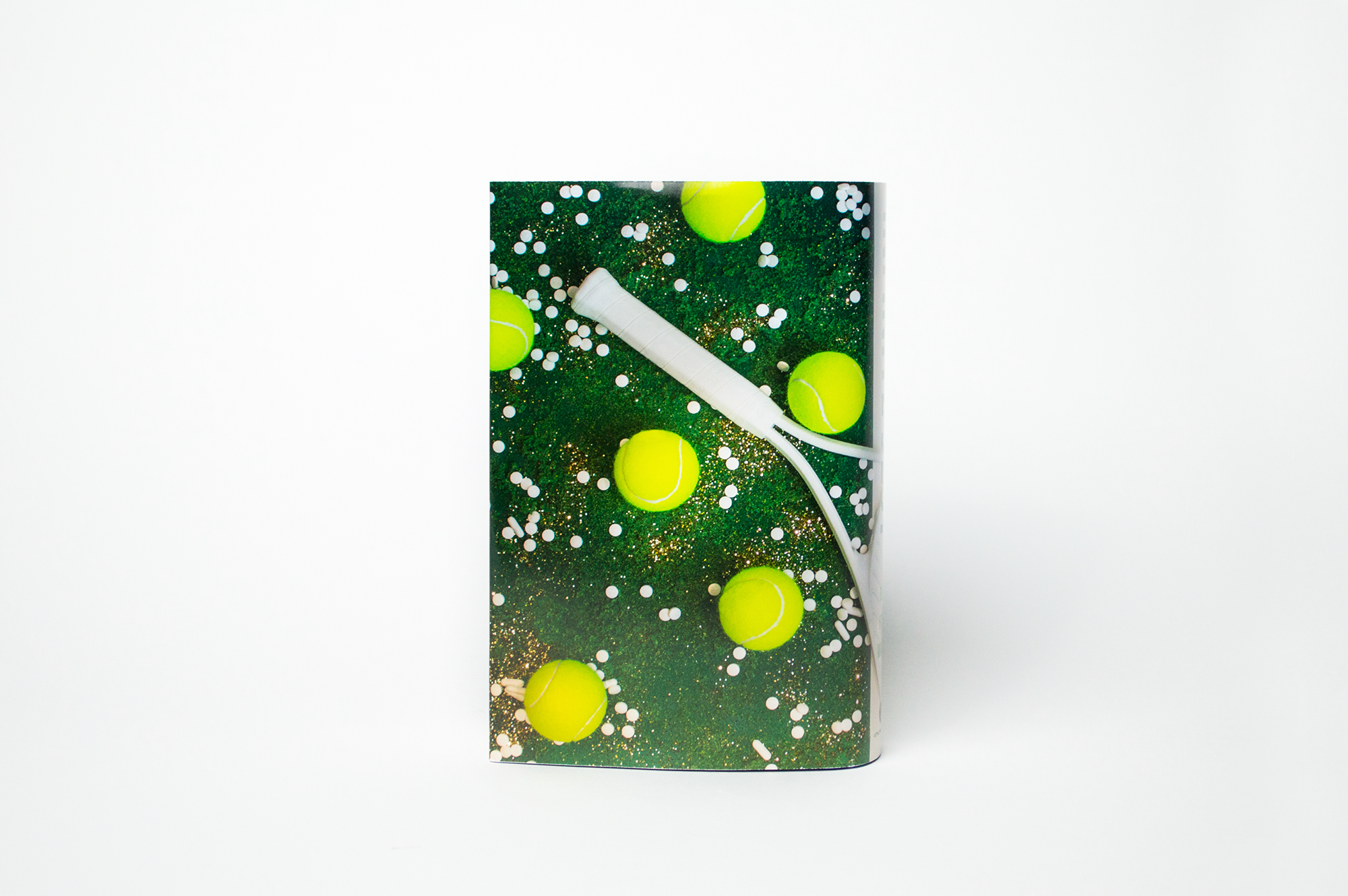
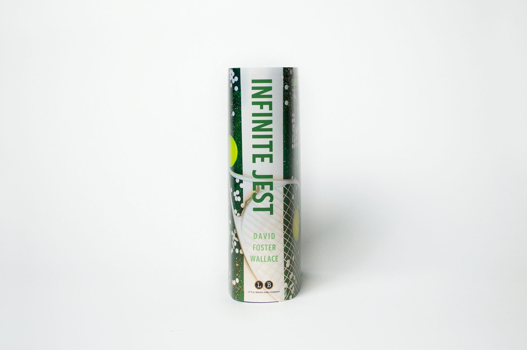
The main setting of the book is a tennis camp for exceptional young players, located near a substance abuse recovery center. Most of the boys at the camp struggle with drug addiction. I used the setting as the main inspiration for the cover, with a photographic set design approach.
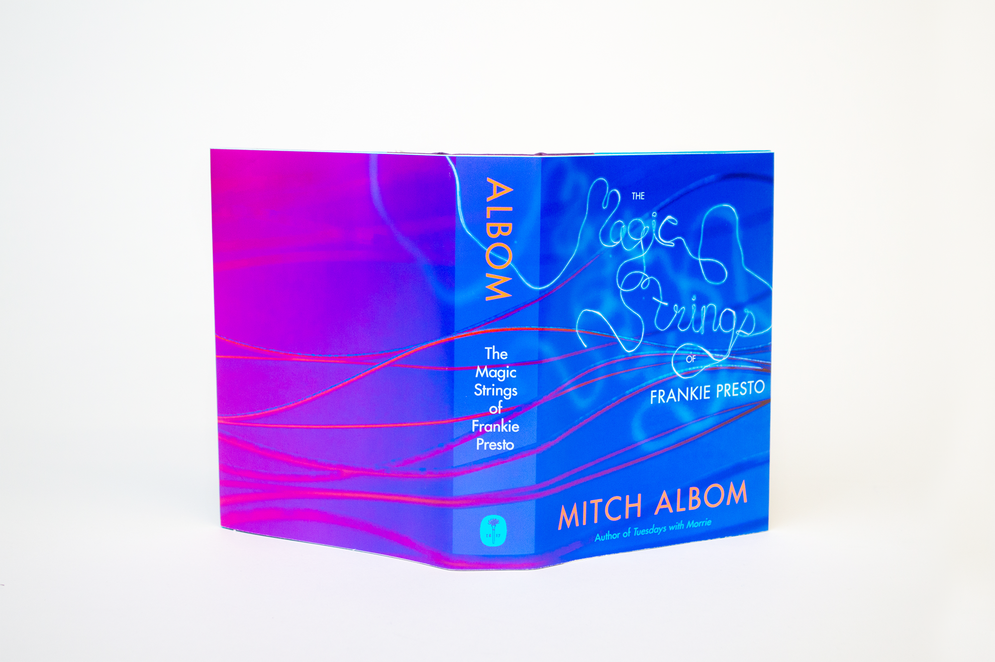
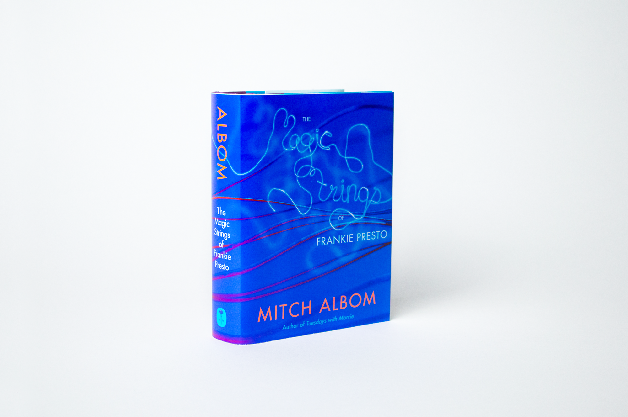
Historical Fiction: The Magic Strings of Frankie Presto
Original Cover.
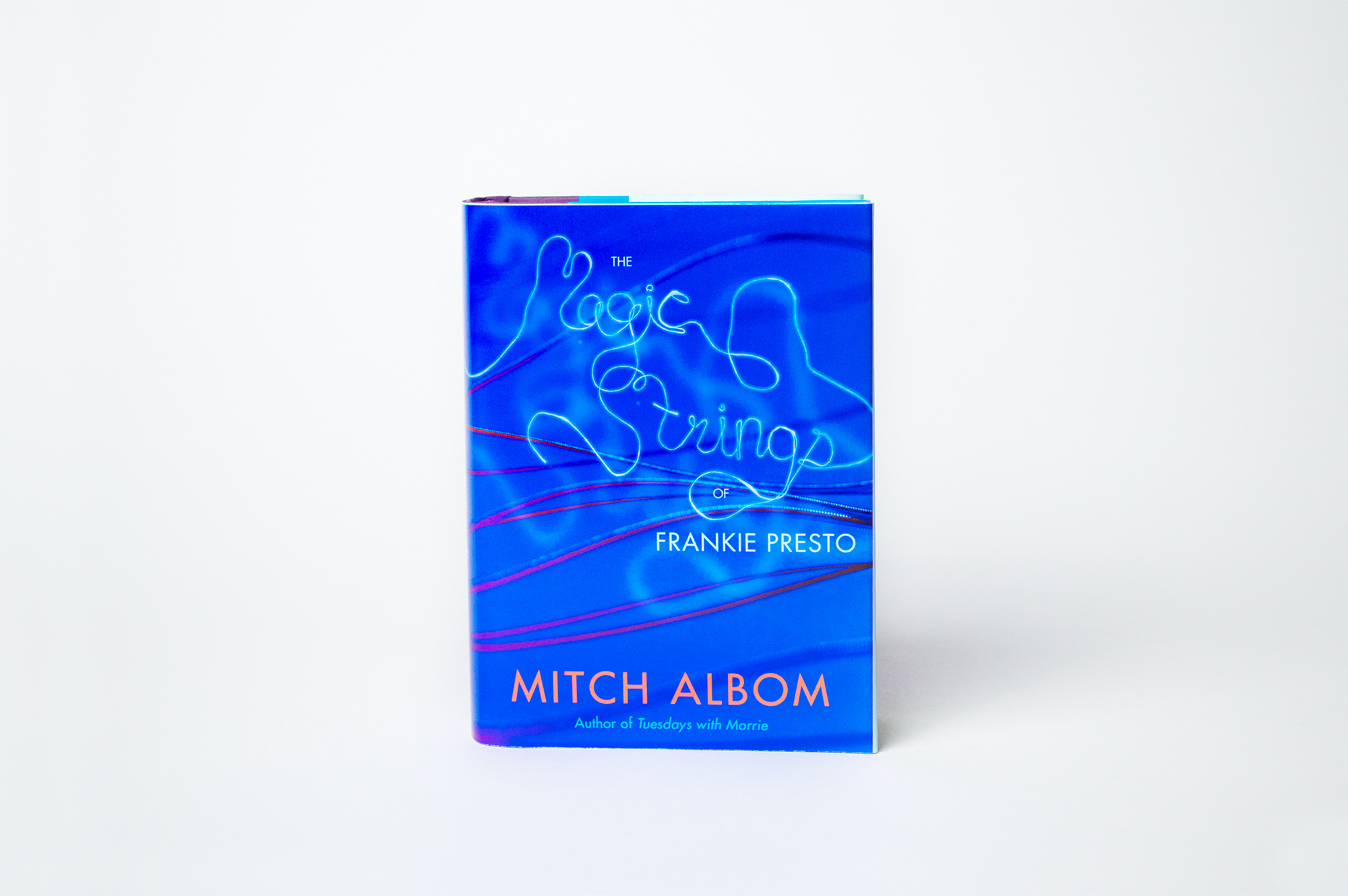
This is the fictional story of Frankie Presto, described to be of the likes of Elvis Presto and the greatest guitar player ever. "His amazing journey weaves him through the musical landscape of the 1940s, ’50s and ’60s, with his stunning playing and singing talent affecting numerous stars" (Goodreads). Frankie has 6 magical guitar strings that turn blue every time he affects or alters someone's life.
I knew blue had to be the primary cover for this cover since the color is used throughout the book to represent the magical power of music in the book. For imagery on the cover, I played around with how to create movement using actual guitar strings that I photographed.
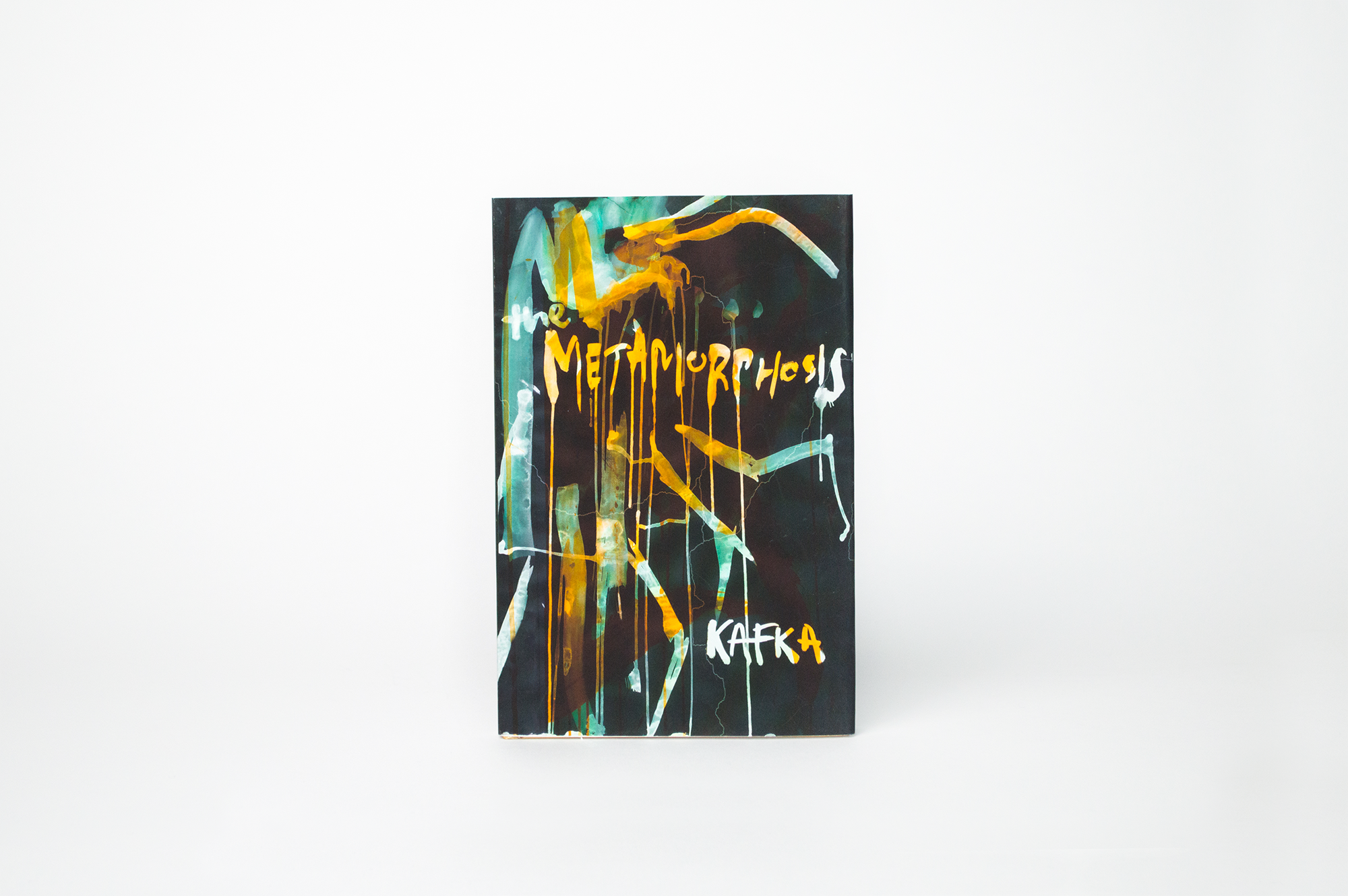
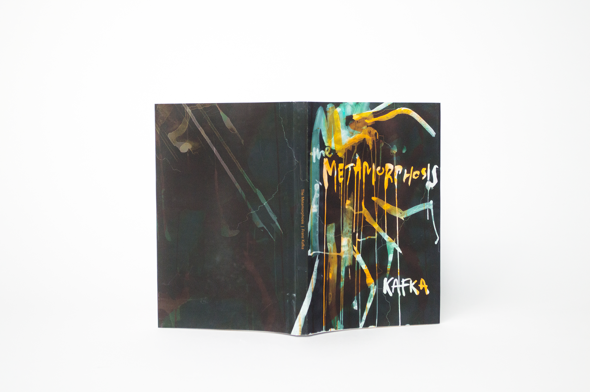
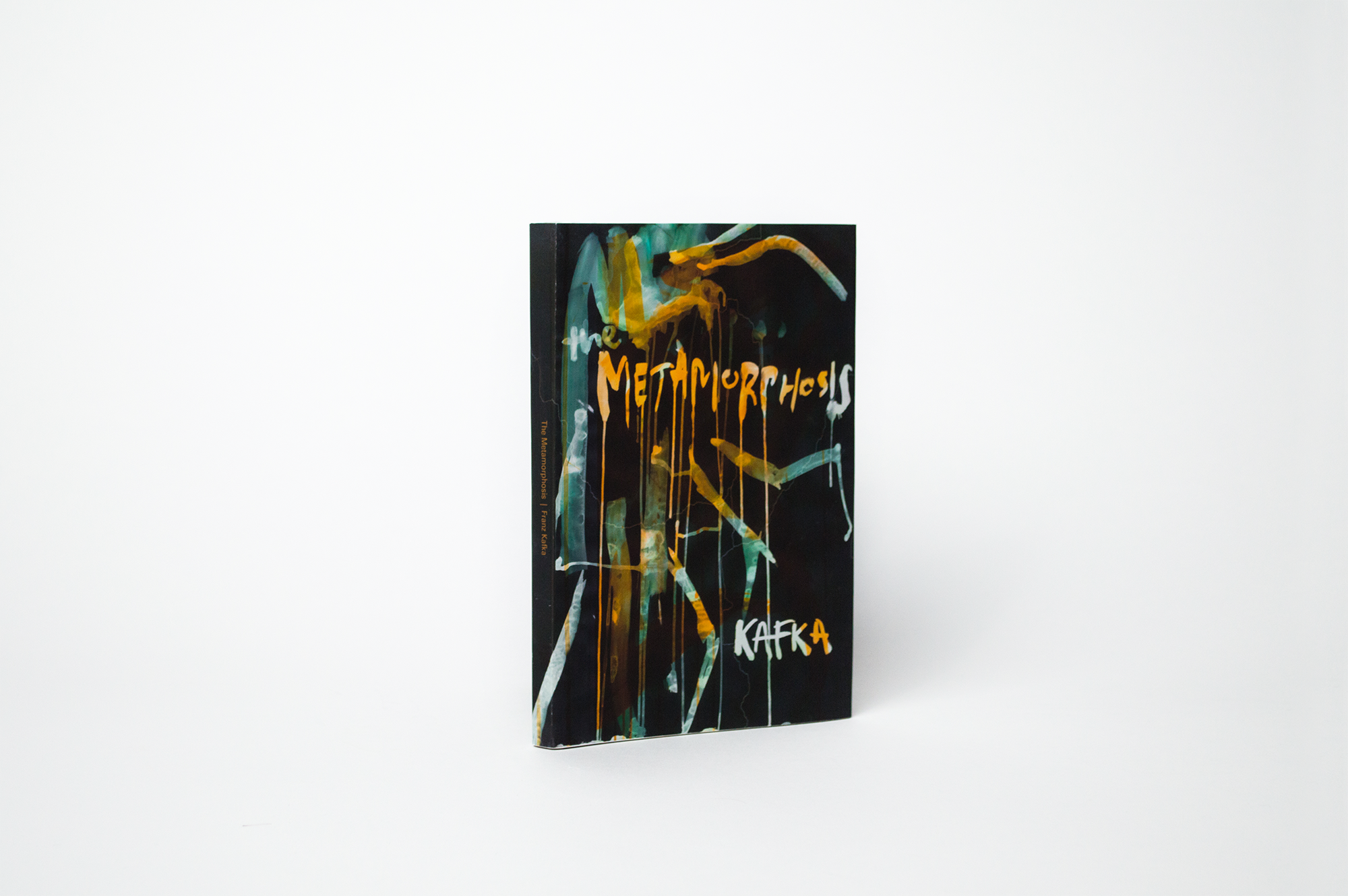
Classic: The Metamorphosis
Original Cover.
The Metamorphosis is an absurd and frightening story about a young man who wakes up to find he's become a giant insect. The book follows the main character, Gregor, and his retreat into isolation from his family. They are terrified and disgusted by his changed form and begin to feel burdened by his existence. Through the color and illustration on this cover, I represent the feelings of horror and disgust that the family has for Gregor following his metamorphosis. The lettering and illustration were hand-painted and digitally altered.
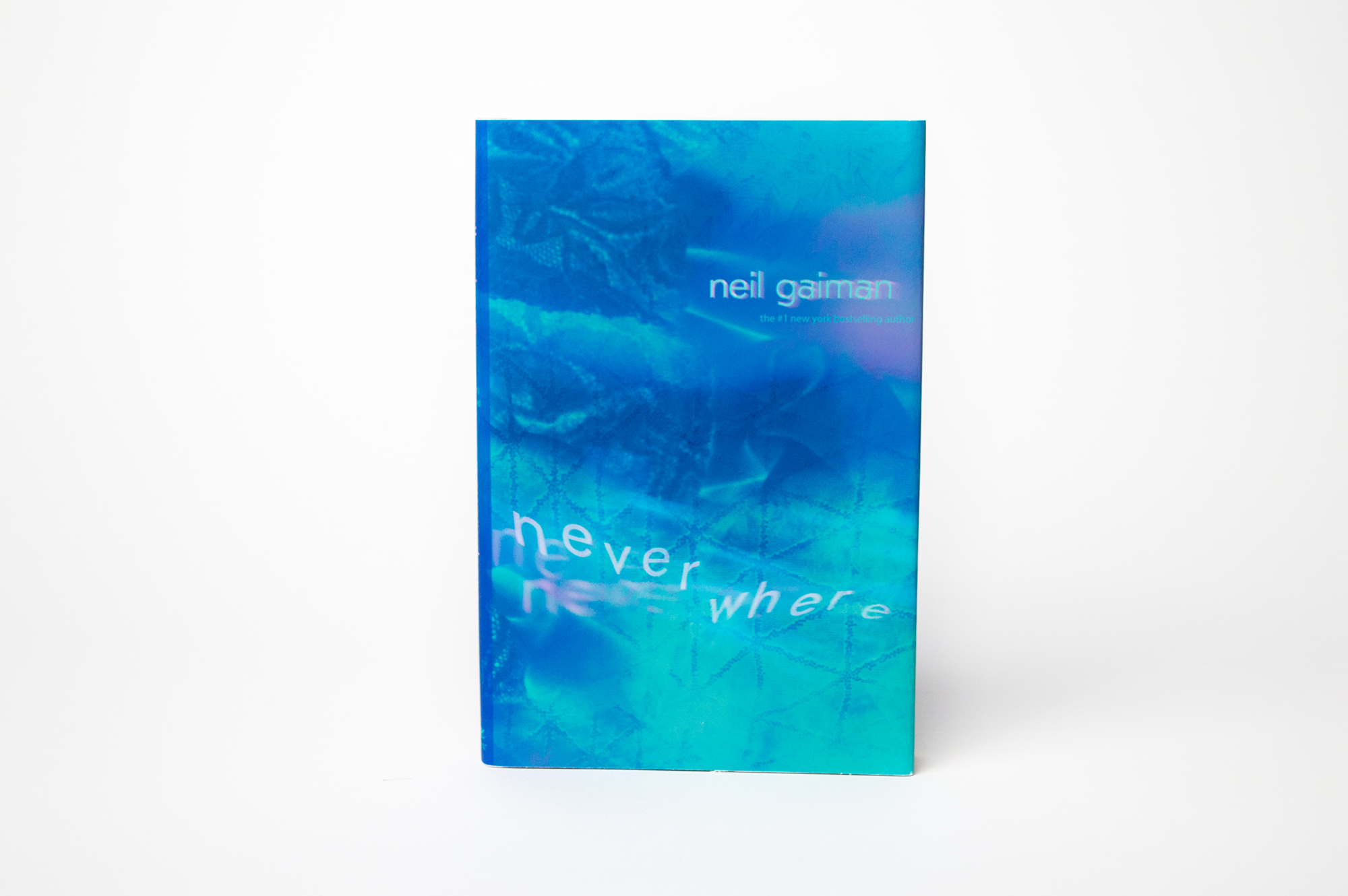
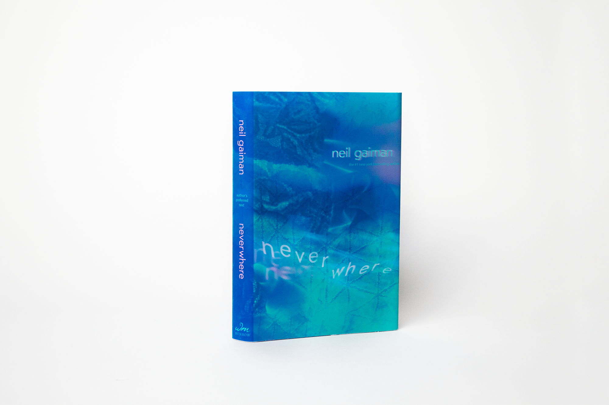
Fantasy: Neverwhere
Original Cover.
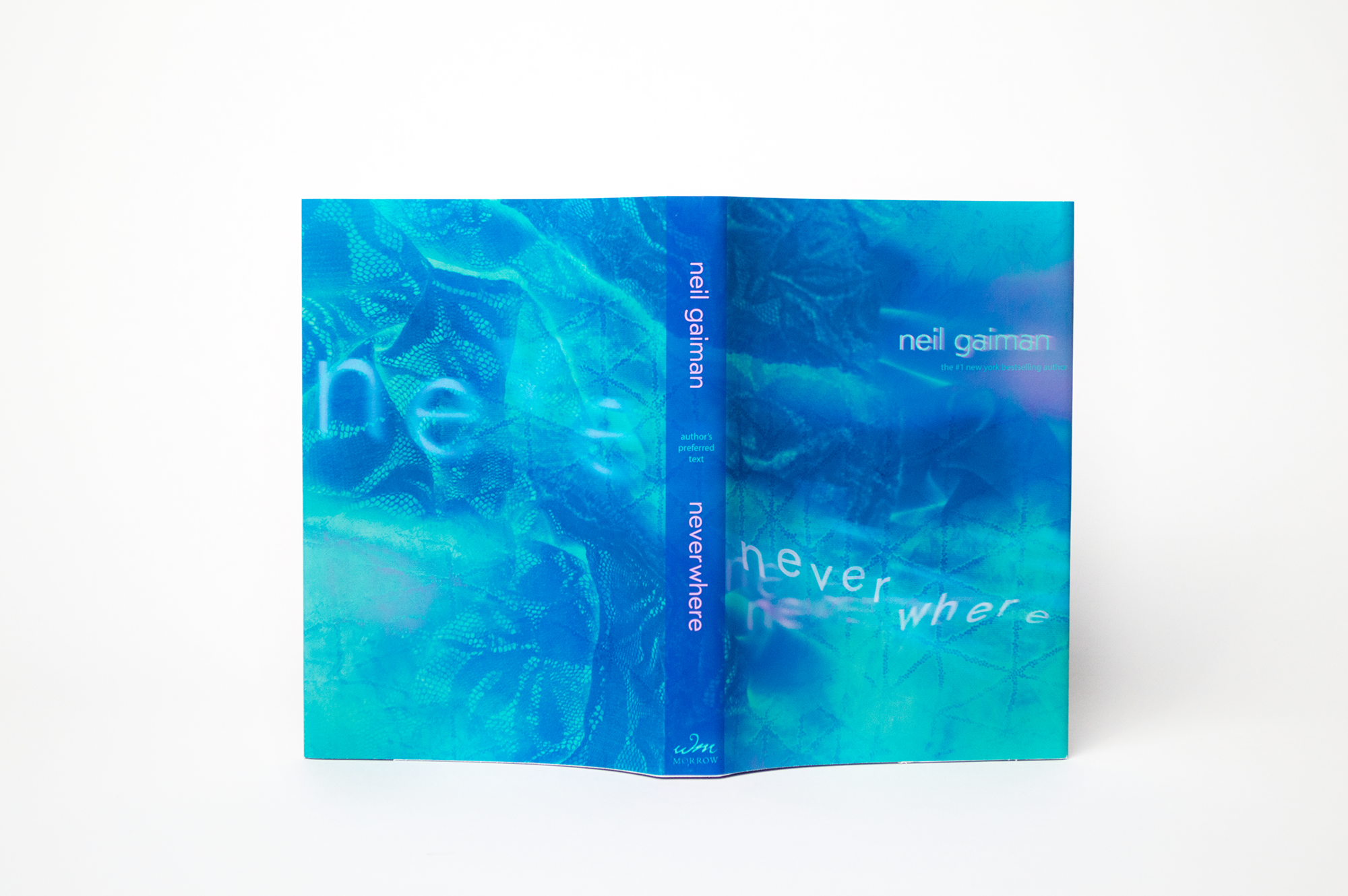
Neverwhere follows a normal man's descent from London into the mystical "London Below" located in the sewers of the streets. Unable to return to his former life, he is stuck in this alternative reality. He embarks on a quest with strange new acquaintances, including a mysterious girl named Door, who dresses in clothes blending many different time periods and has the ability to transport to different locations.
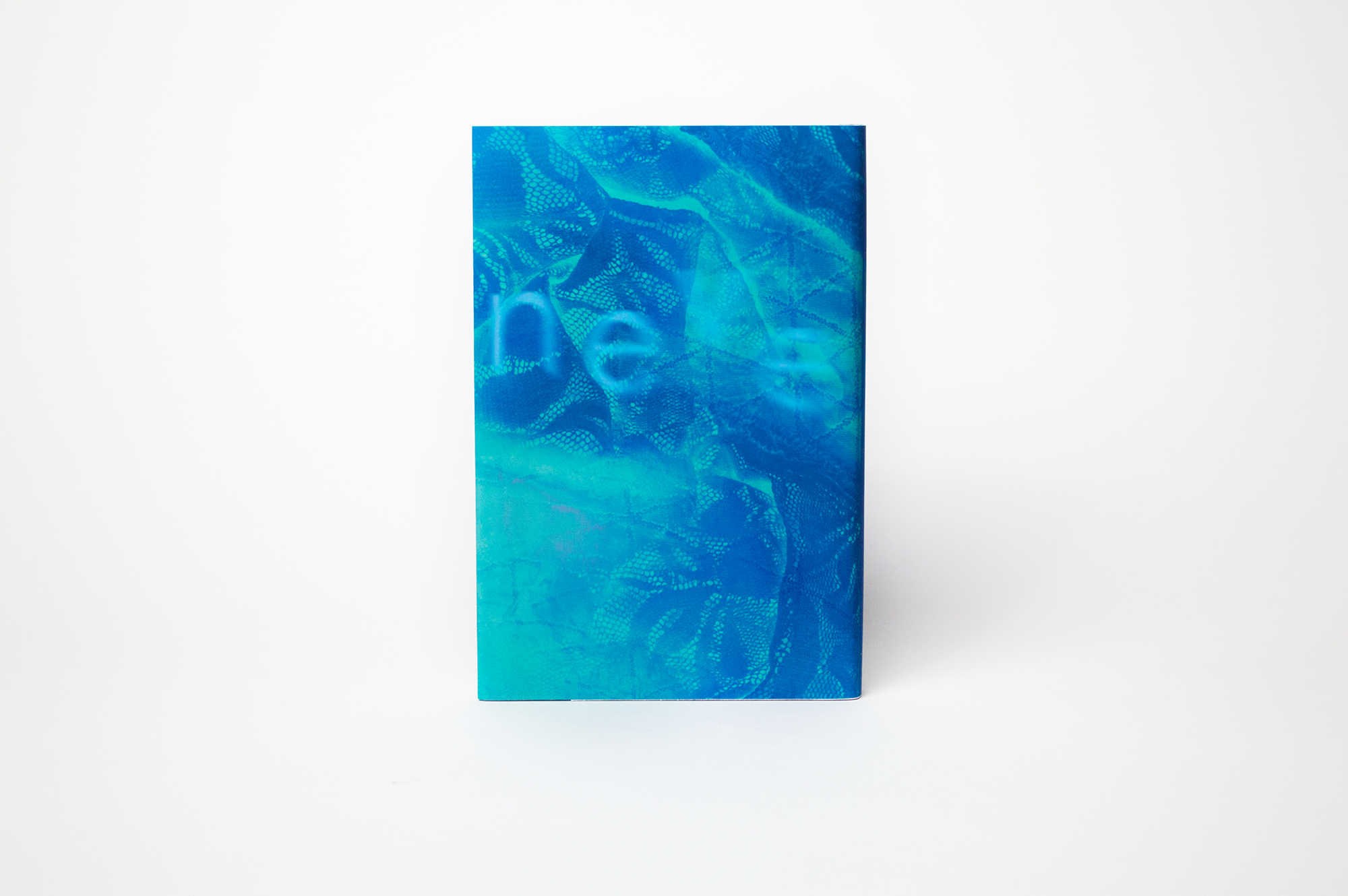
For the cover, I blended the dark and eerie setting of London Below with hints of fabric of Door’s clothing. The colors represent the dark tone of the fantasy book.
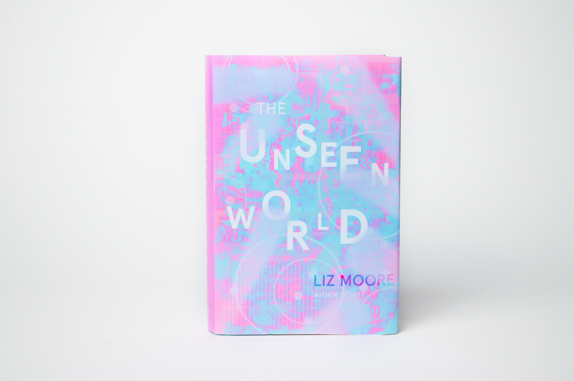
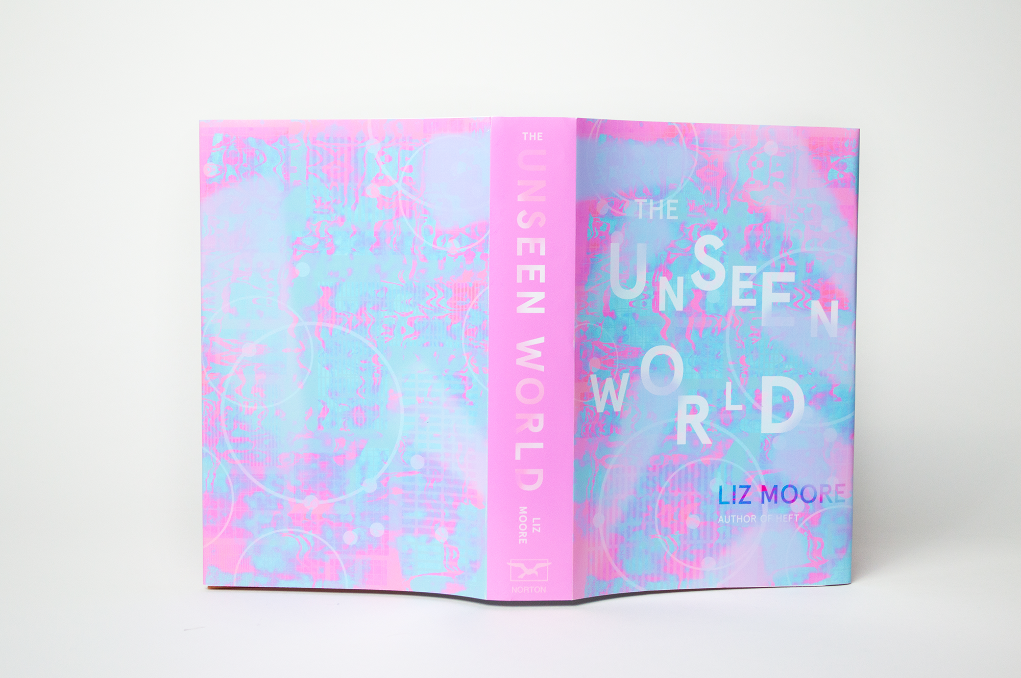
Mystery: The Unseen World
Original Cover.
Set in the 80s, the main character, Ada, is raised by her eccentric father. Ada spends her days in the computer science lab that he works in. Due to Alzheimer's, he becomes unable to finish his life's work of creating a digital universe. Following his death, Ada lives in uncertainty, trying to both understand who her father was and what he was actually living.
For the cover, I used colors and shape to represent the technology world of the 80s. The warps and blurs are inspired both by the father's Alzheimer's, Ada's confusion and uncertainty, and the mysterious nature of the story.
Philosophy: Walden
Original Cover.
I chose to read this book because Walden Pond is one of my favorite places to visit. The book is about personal introspection in a natural setting. His time at the pond had that effect on him. Now, because of his book, you will often find people visiting Walden Pond hoping to gain that same level of transcendence from the beautiful nature around them.
The palette for this cover includes pure green and blue tones, both being shades described in the pond. To create the cover, I collaged together images I had taken of plants, and digitally painted over them.


