
Assemblage
Identity / Environment / Visual Design / Gallery / Print
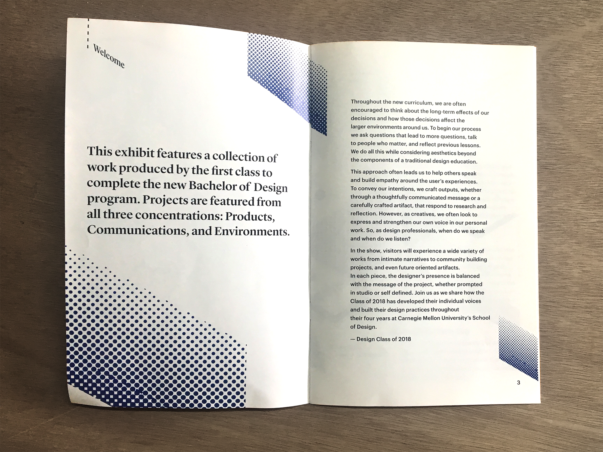
Overview
"Assemblage" was the theme of my CMU class’ senior show.
Role
I worked with others on the team to define the brand guidelines. I also designed all of the vinyl, which was our way of bringing the brand into the gallery space.
Teammates
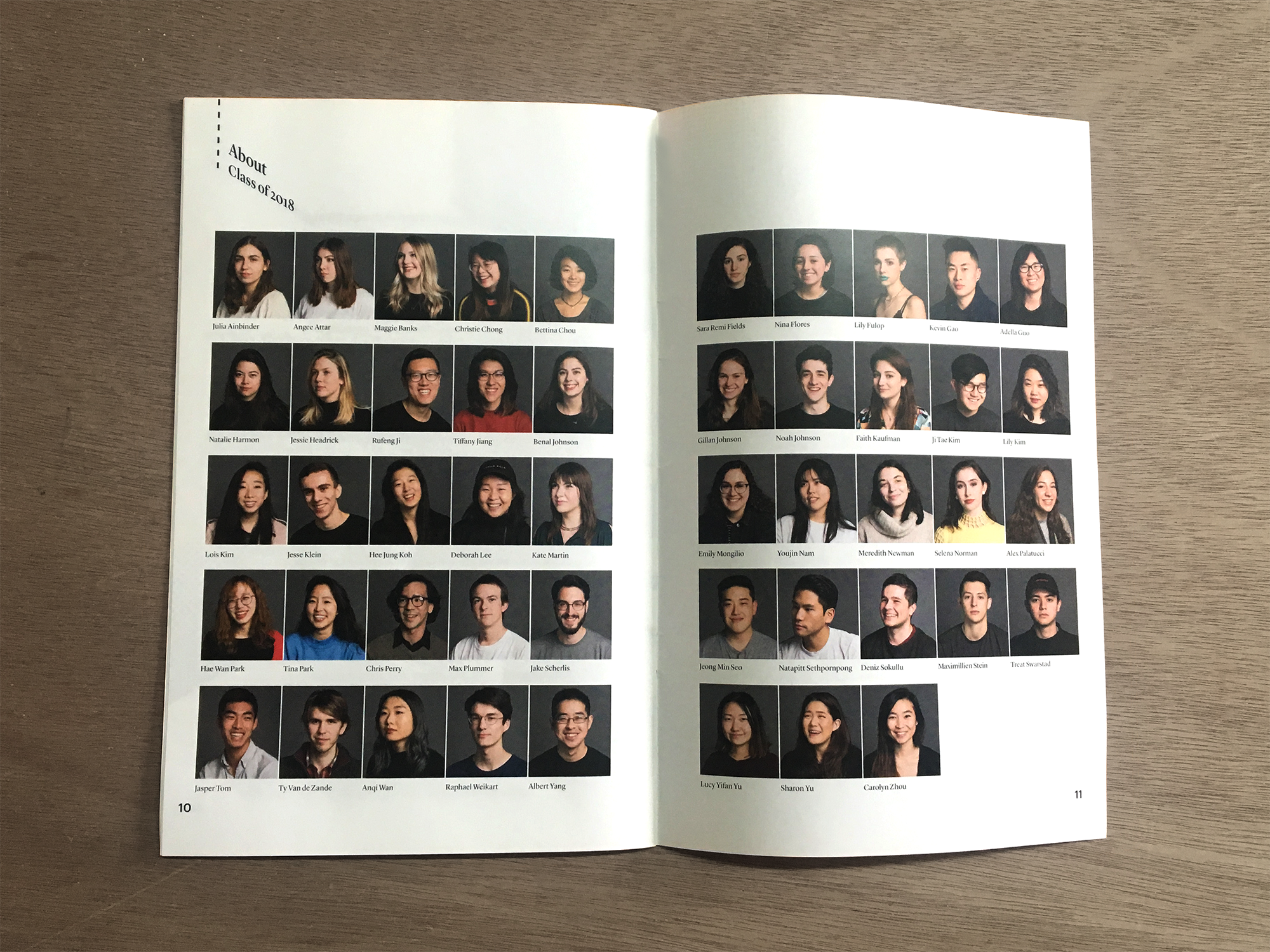
Of our class of 48, a team of 12 of us worked on the branding and marketing for the show.
Duration
The project lasted about 1.5 months.
Outcomes
In the end, we found a design language that pleased the class as a representation of our diverse range of work and personalities.
Final Pieces
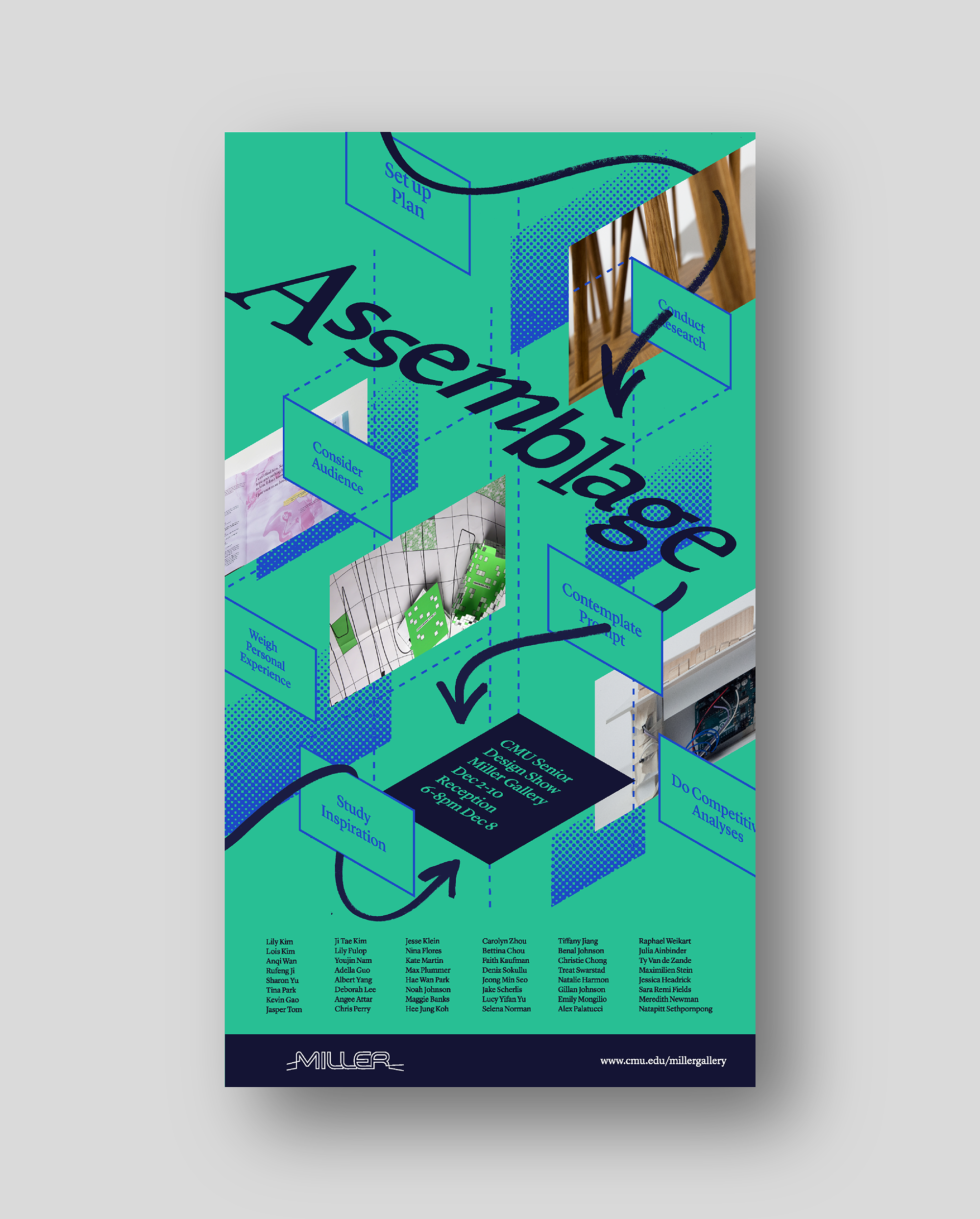
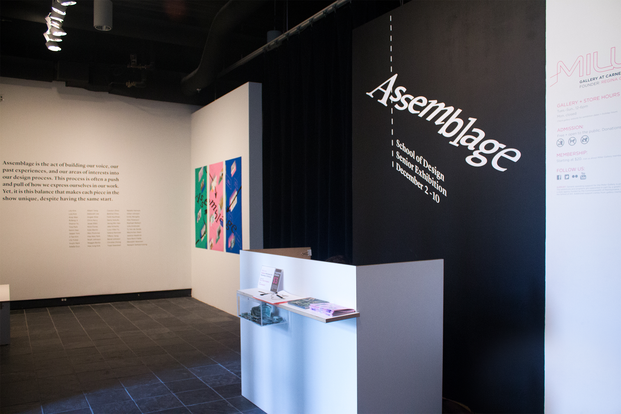
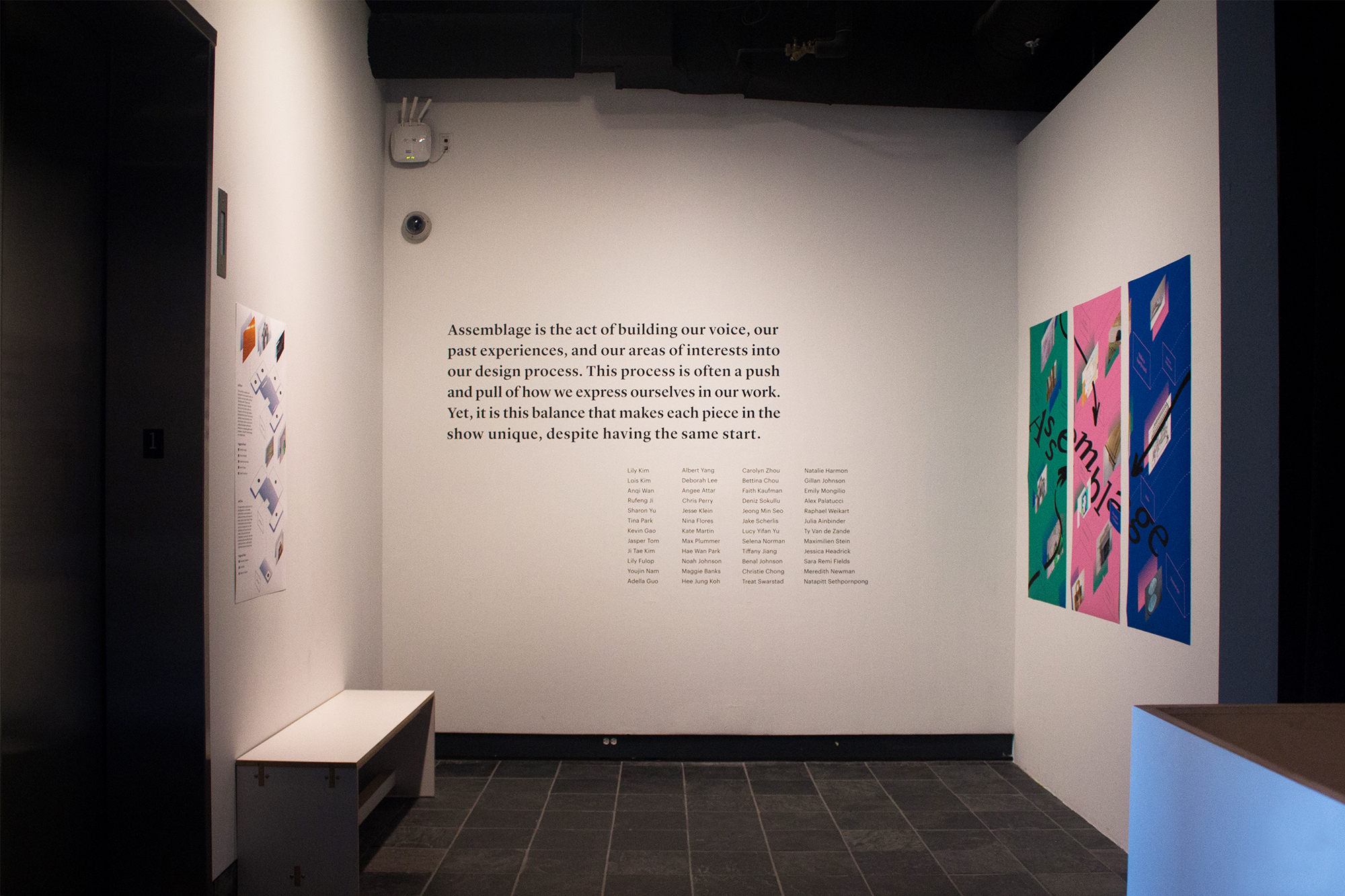
Assemblage is the act of building our voice, our past experiences, and our areas of interests into our design process. This process is often a push and pull of how we express ourselves in our work. Yet, it is this balance that makes each piece in the show unique, despite having the same start.
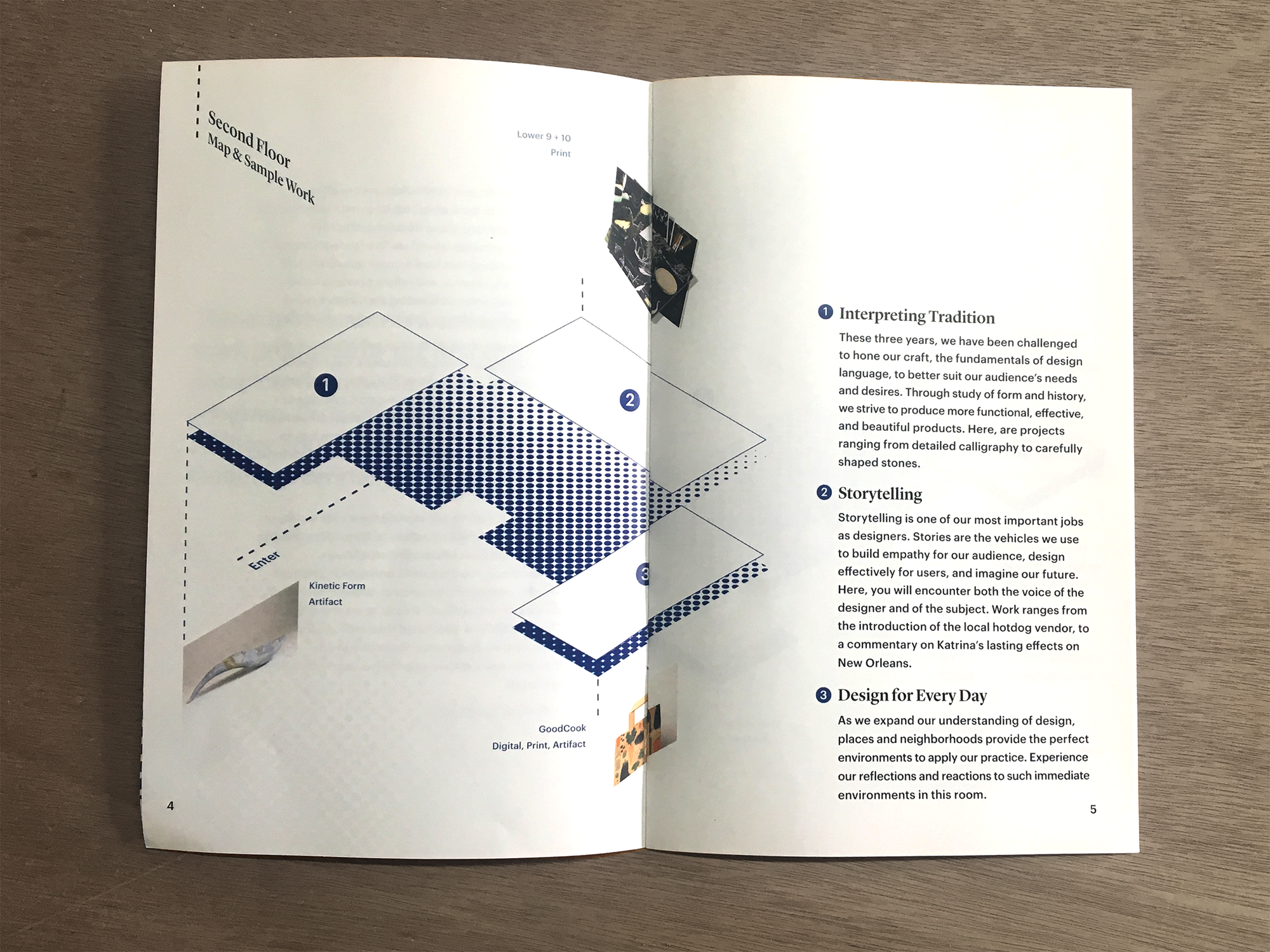
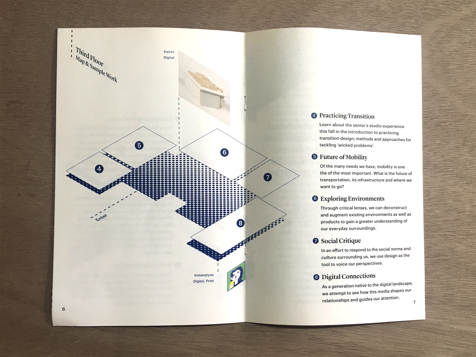
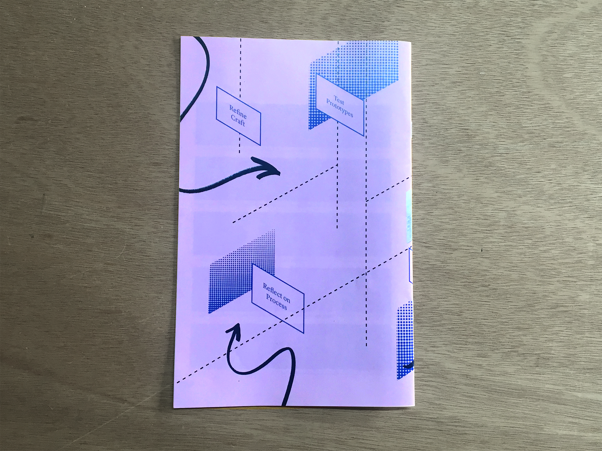
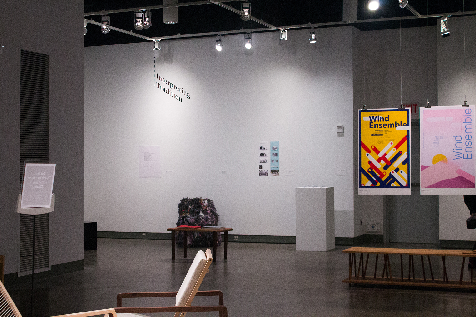
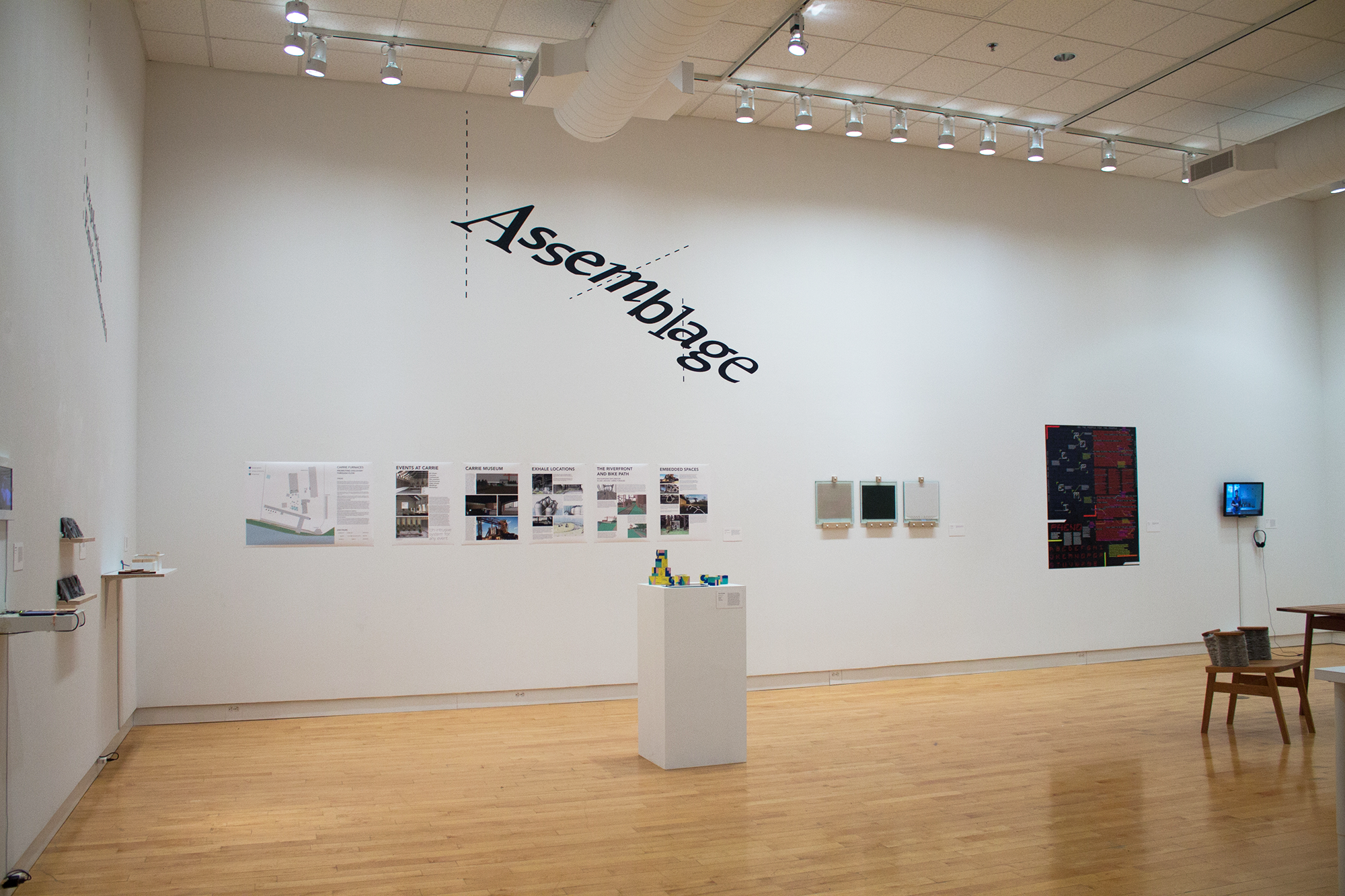
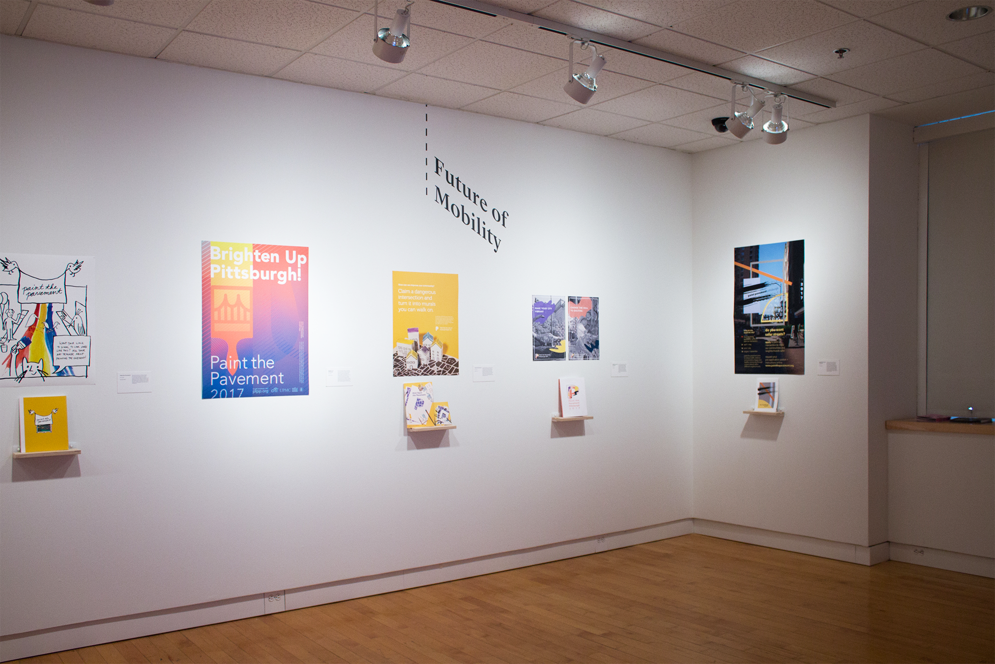
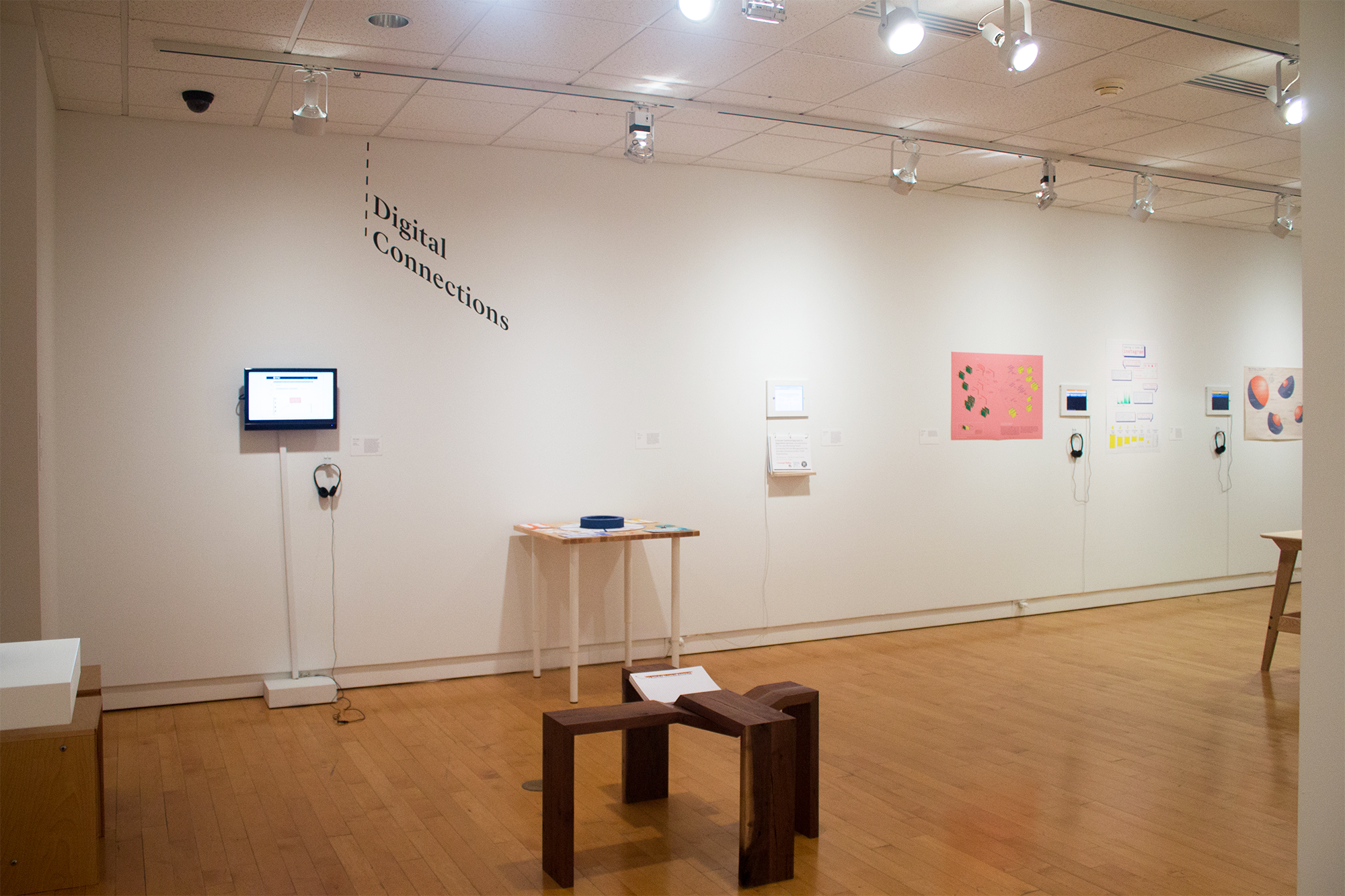
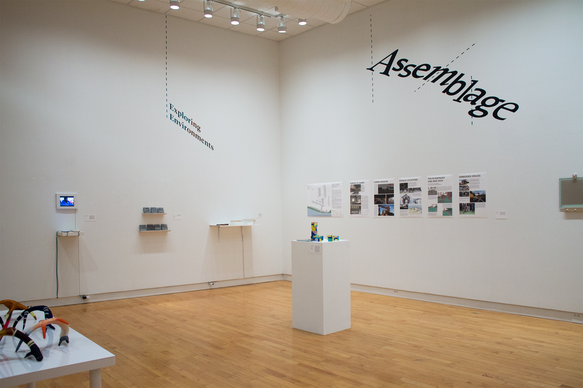
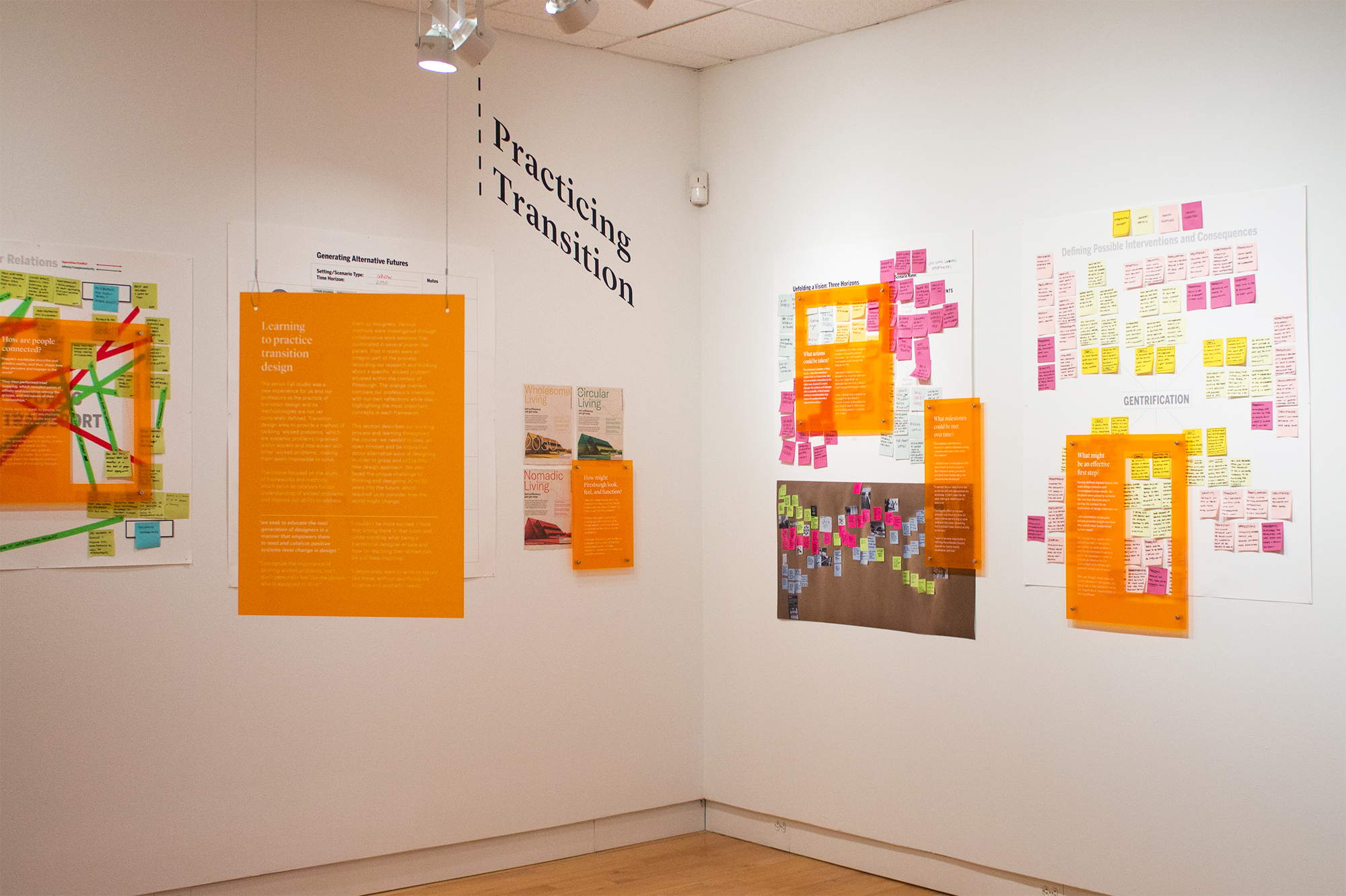
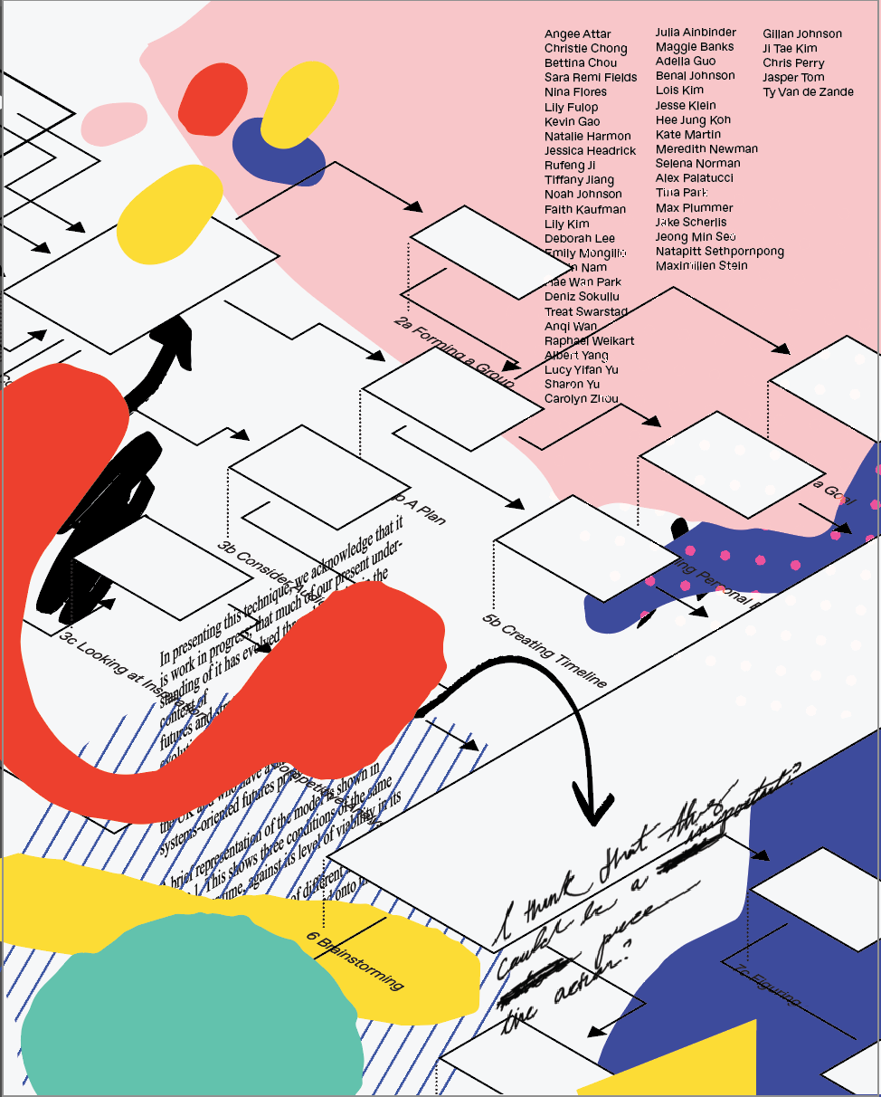
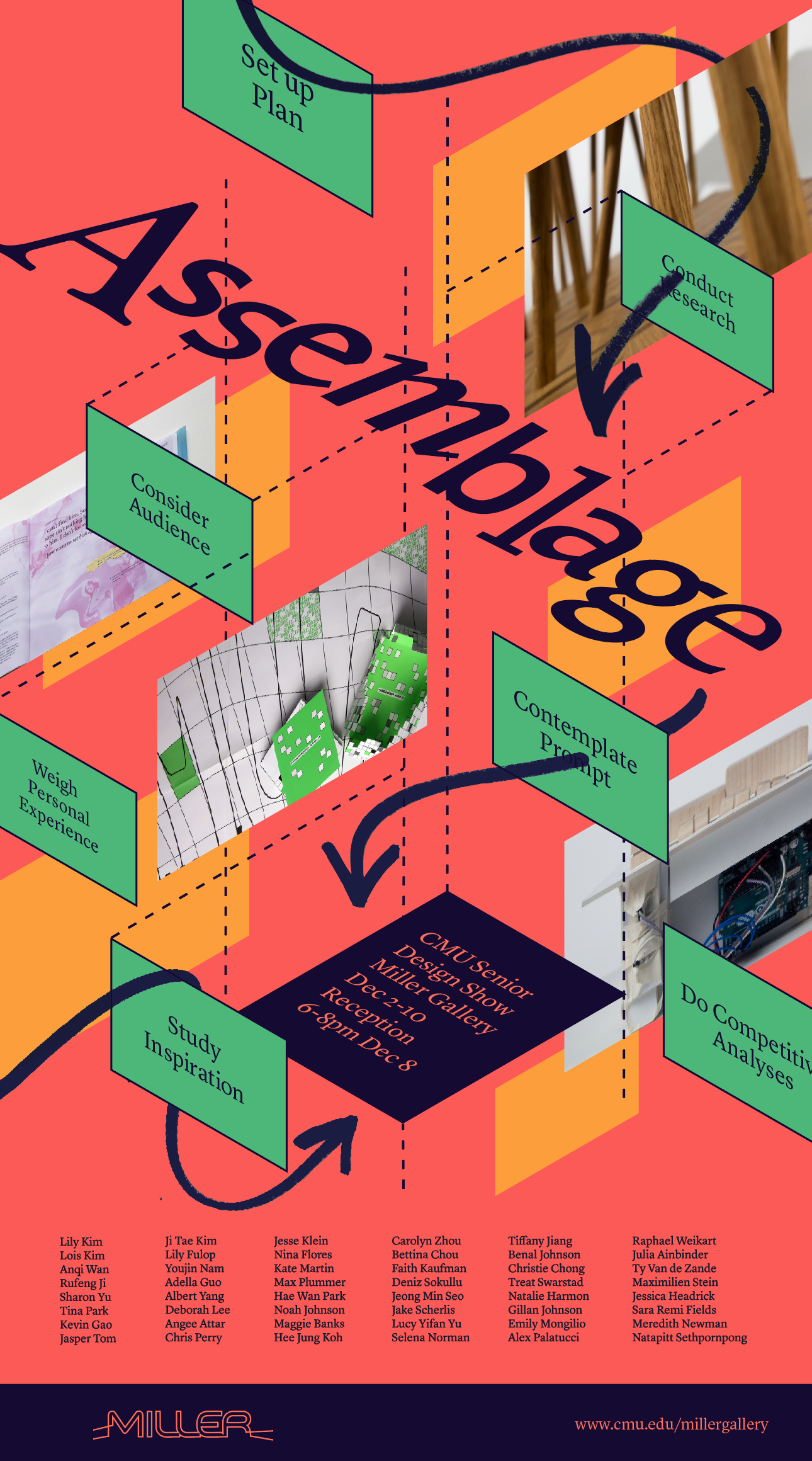
The visual language is designed to look like an annotated and expanded schematic of our design process. It explains how we make/assemble our designs. It is cross-sectioned by examples of our work, which come together into the "Assemblage" that is our show.
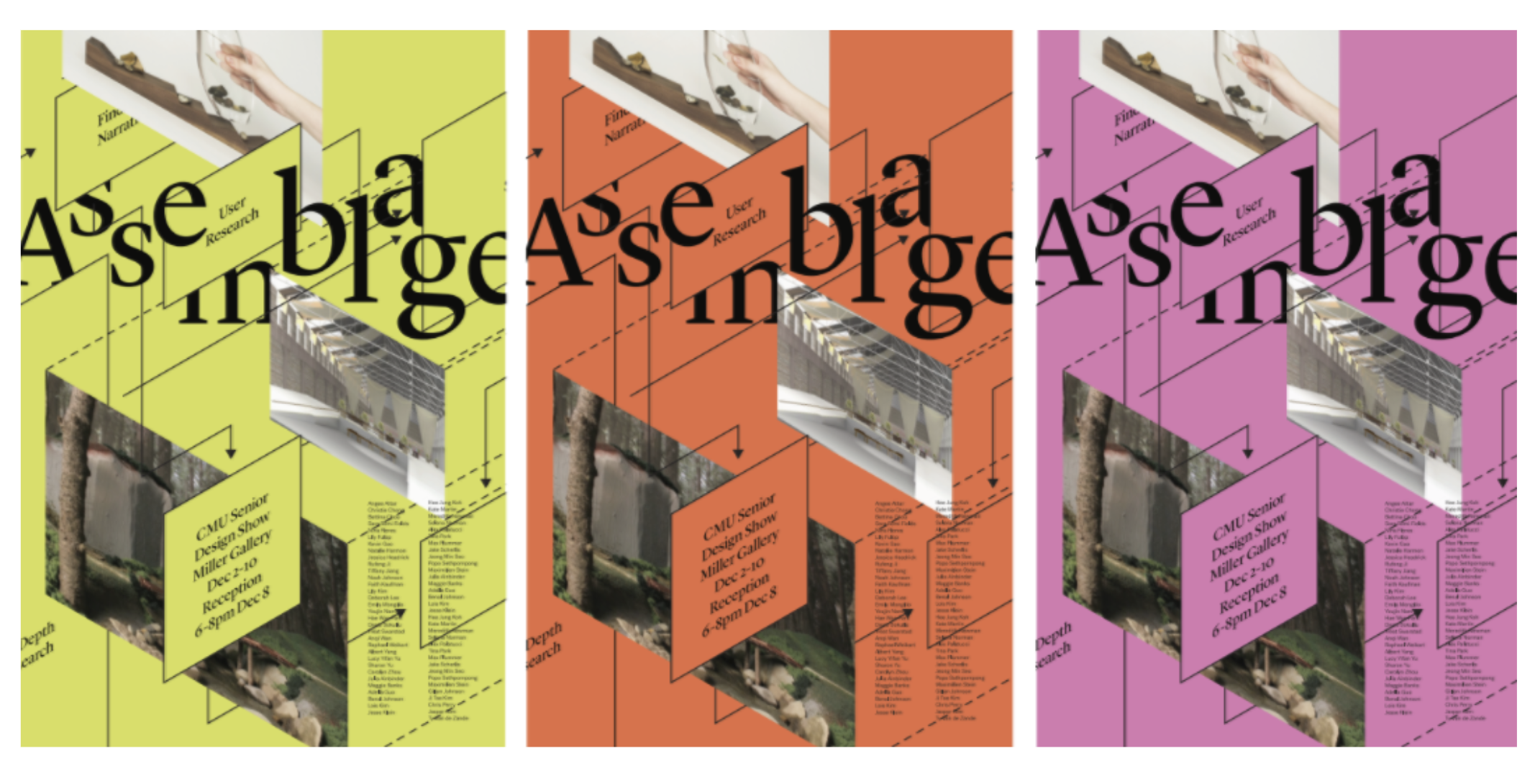
Posters
We hung up posters on the first floor of the gallery. The posters were also placed around campus to advertise the show.
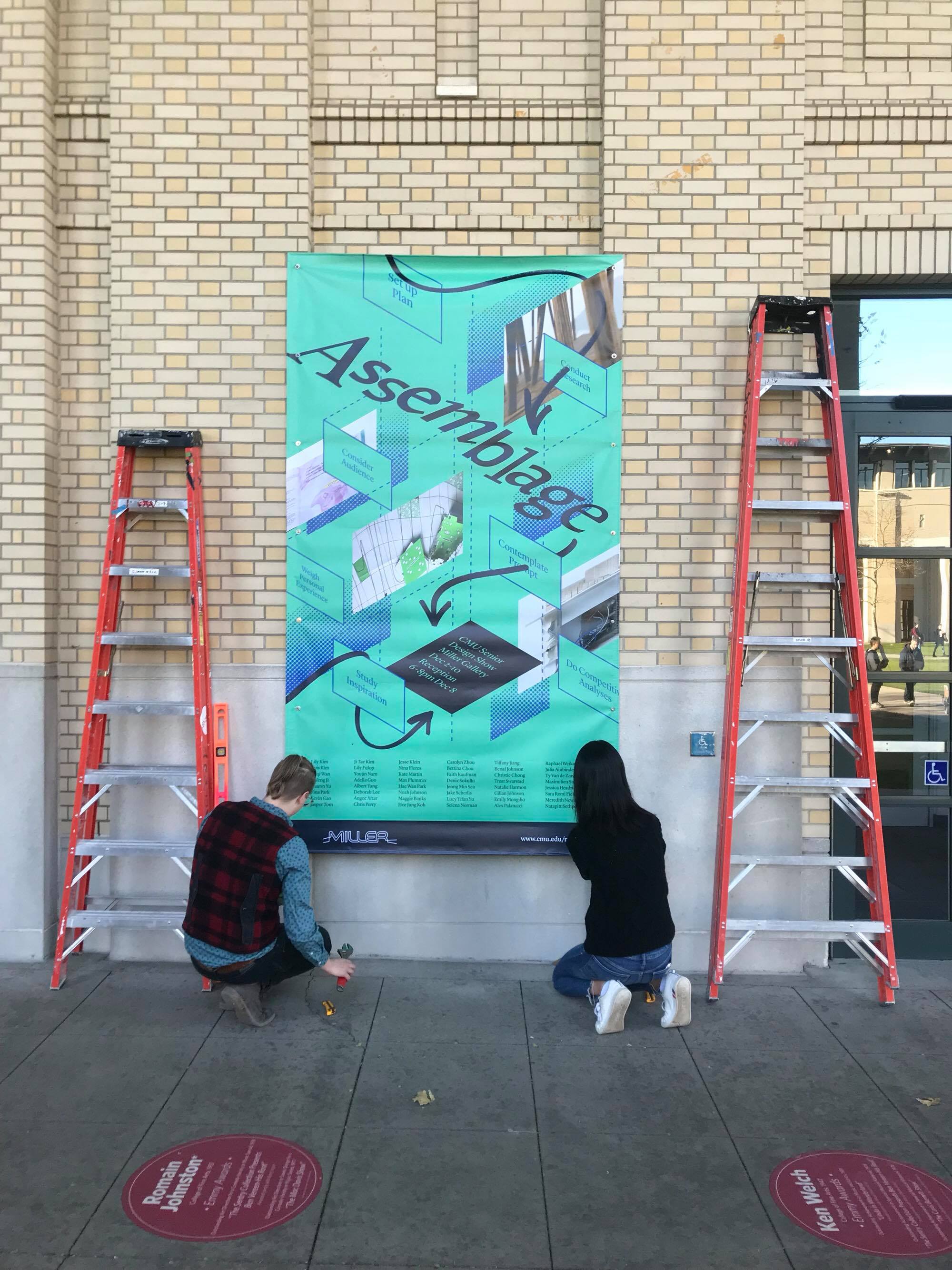
A larger banner was placed directly outside the gallery space to advertise the show to people walking past.
Video
This motion piece was projected on the second floor of the gallery. In the video, images of the Senior class move in perspective around the logo. The videos are attempts to capture each student in the class' personality.
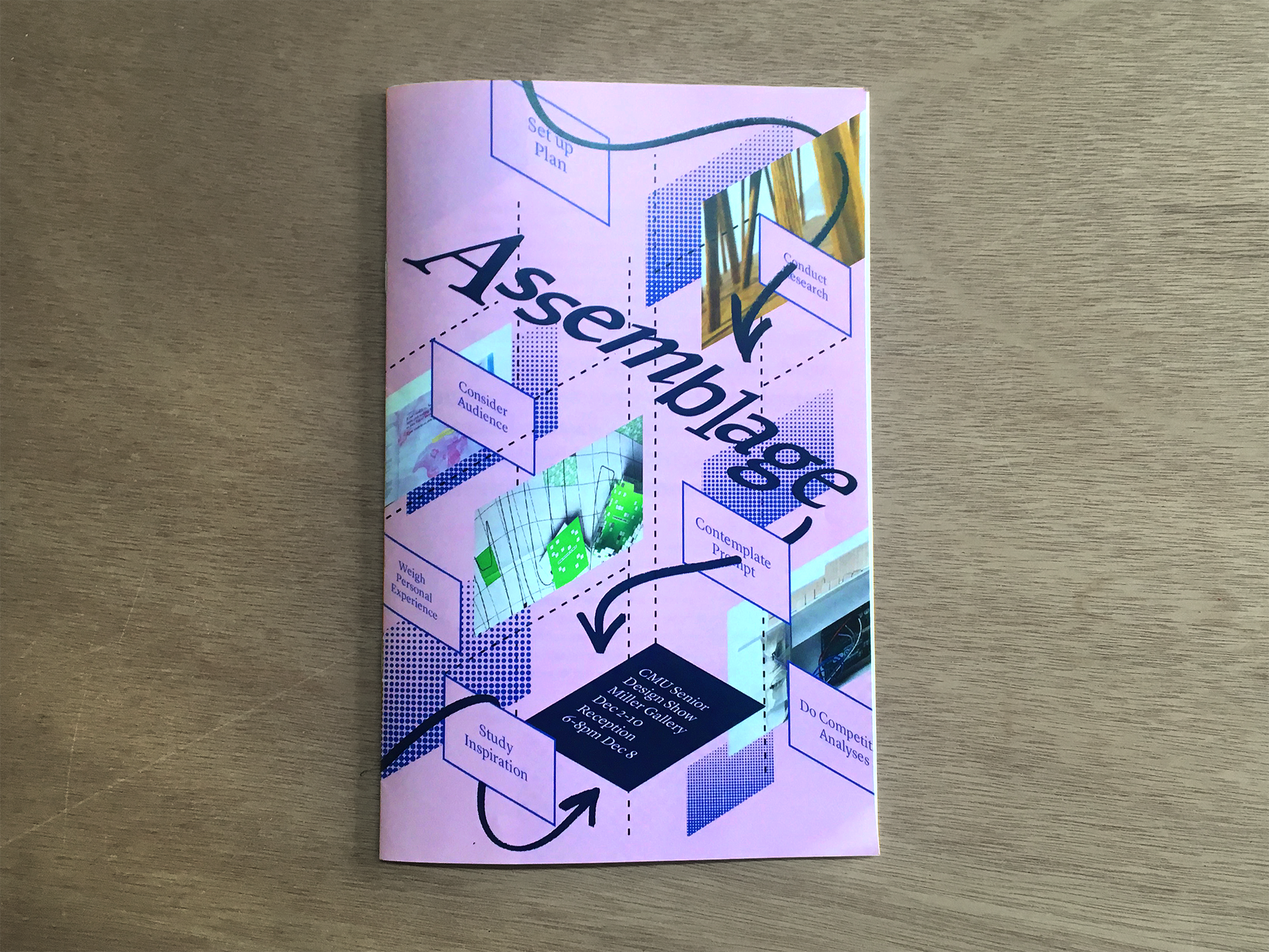
Booklet
The booklet display was located at the entrance of the gallery.
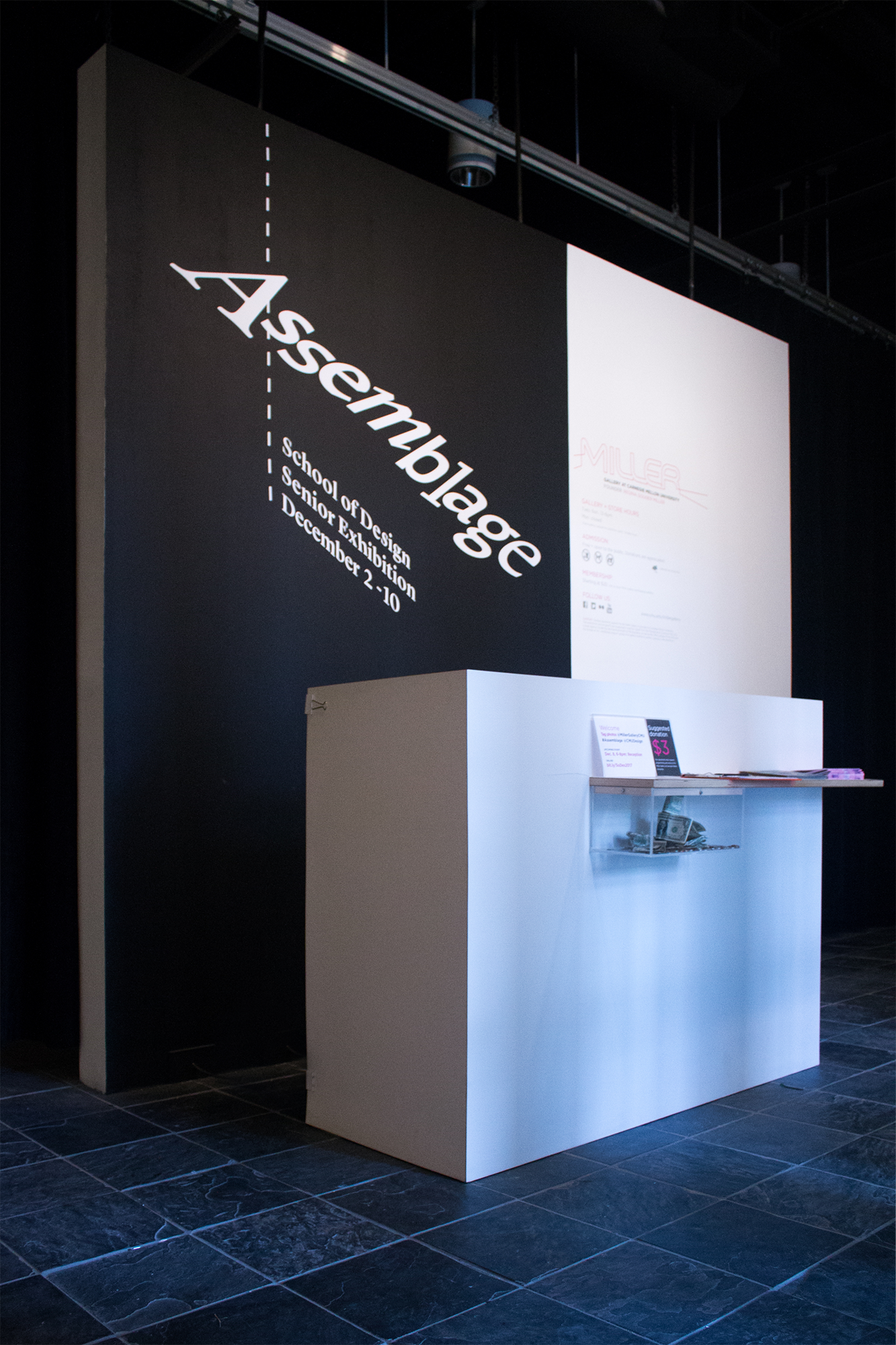
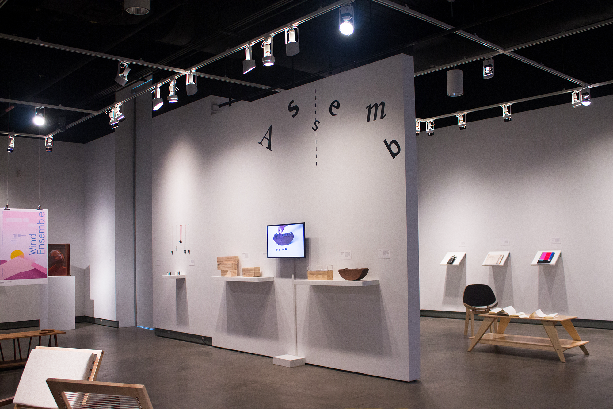
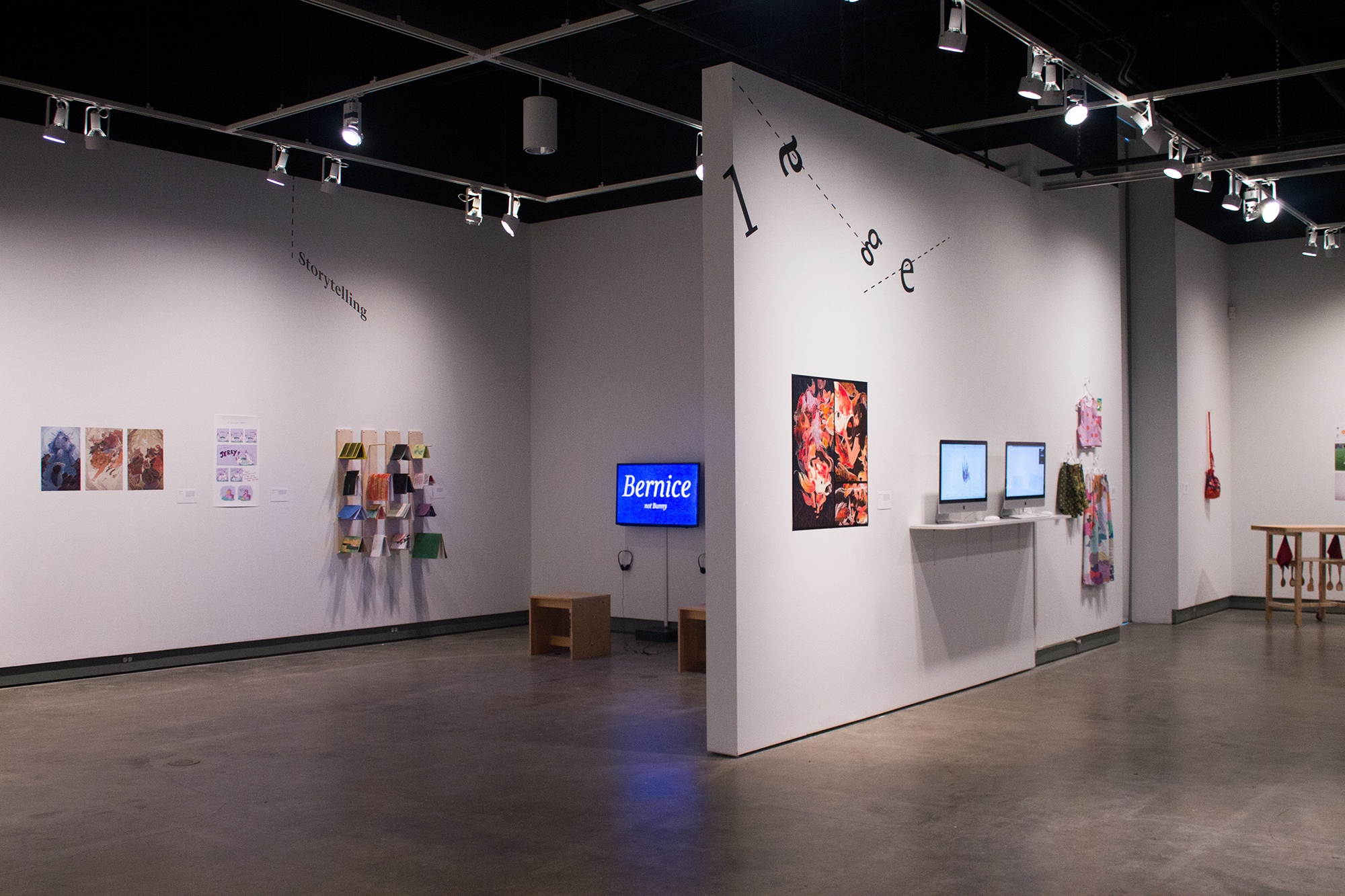
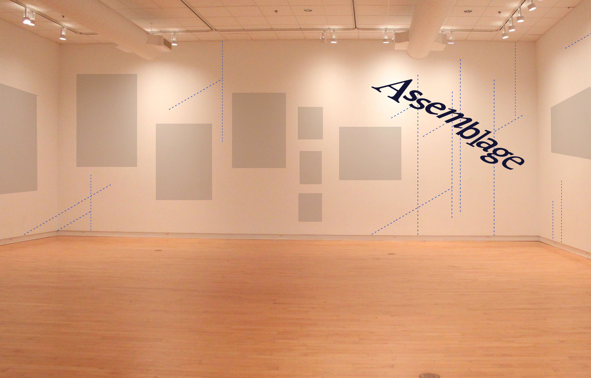
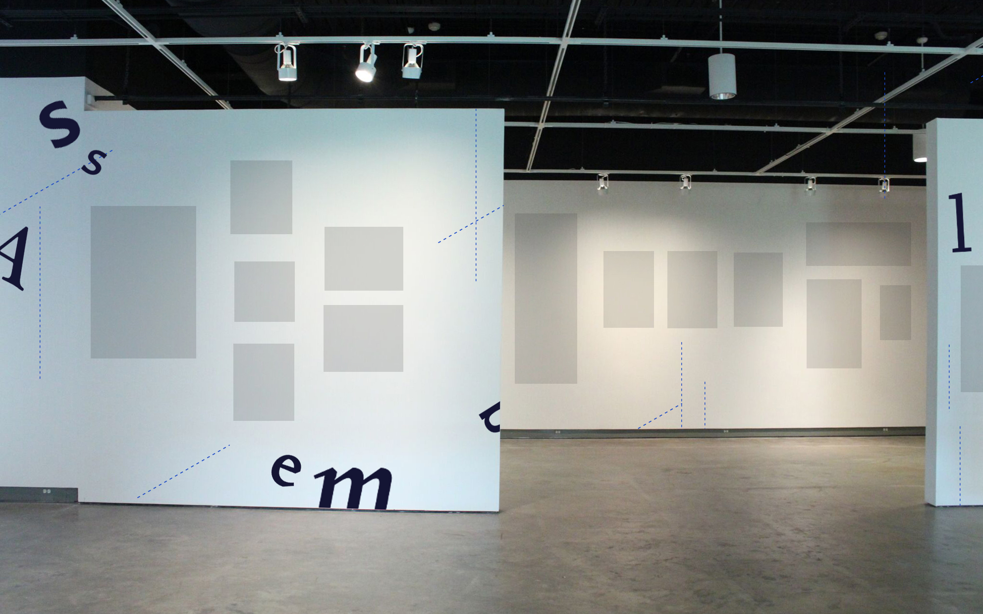
Vinyl
The vinyl on the first floor shows the Assemblage logomark, class details, and concept.
On the second floor, the work starts to break across different themes. The logo breaks apart to match the distribution of work. We also created vinyl labels for each section of the work.
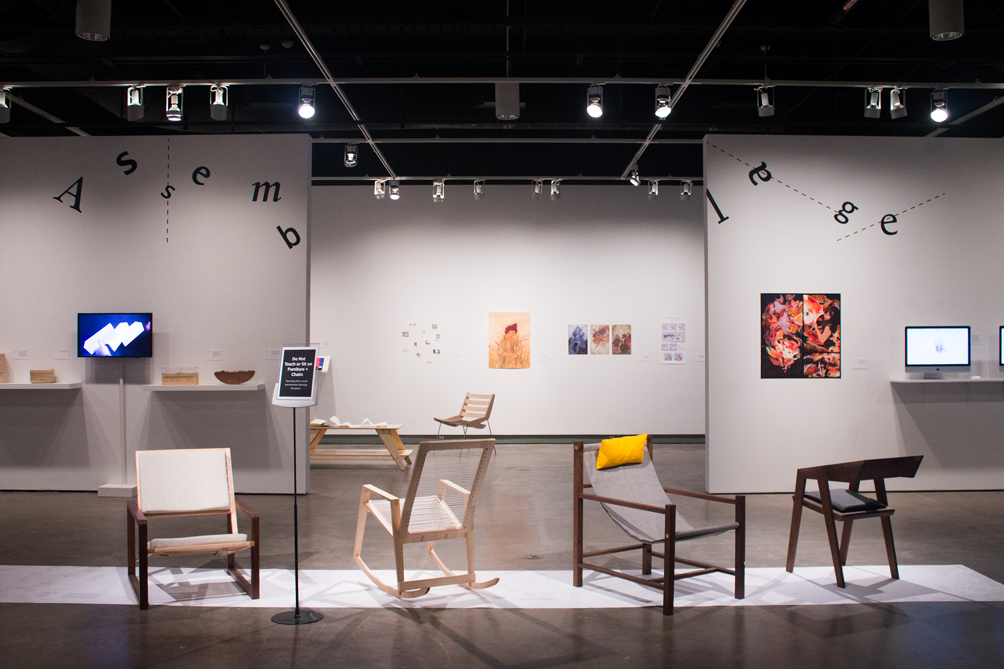
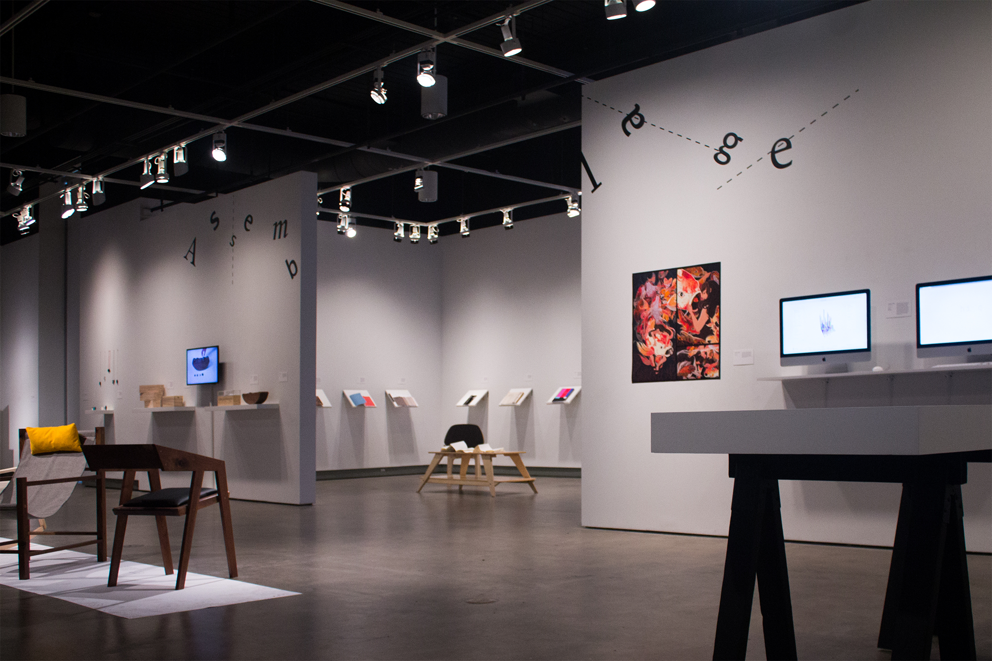
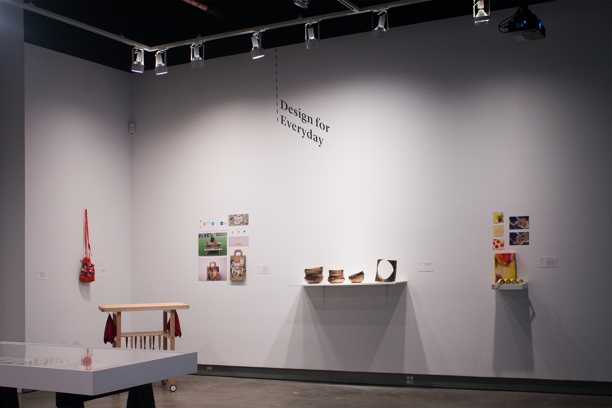
On the third floor, the logo appears assembled again. This time, it is larger, and placed above all of the work on the floor.
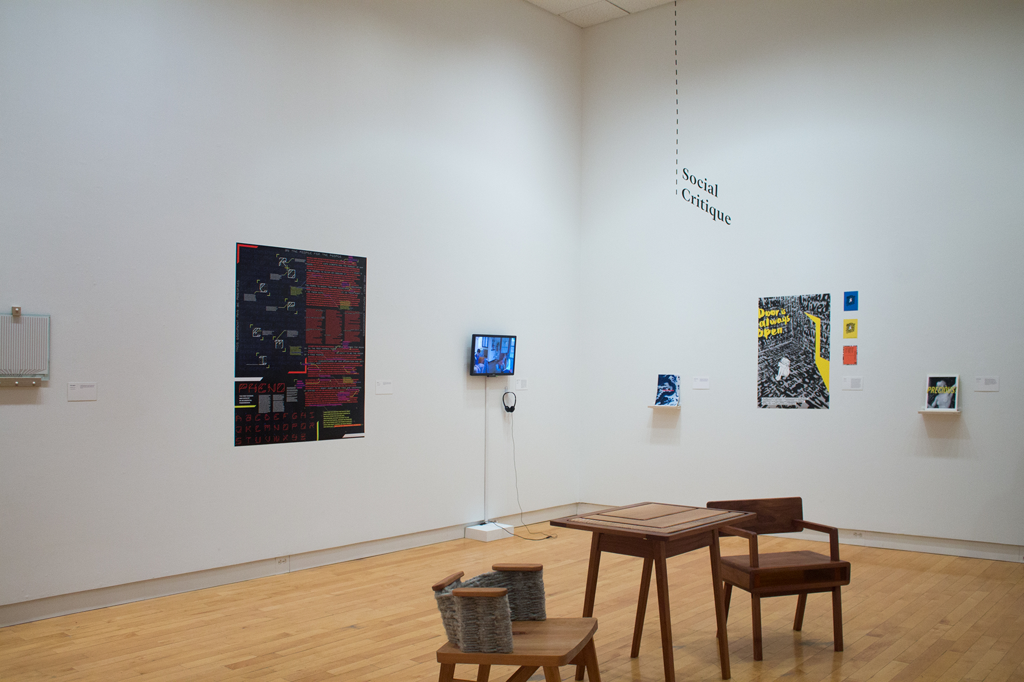
Labels
Map
Each floor had a map by the elevator to orient the viewer and explain the different sections of the gallery. The map was also featured in the booklet.
Process
Defining the Brand
The branding team held meetings 1-2 times a week. At the beginning, we separated into sub-teams before each meeting, and worked together on wordmarks and brand concepts. Then, when we gathered, we would discuss what was or was not working. Sara Remi, Sharon, and Treat worked together as a sub-team and presented what became the final concept of "Assemblage." We presented a schematic of the design process as a starting off point.
Wordmark Explorations
We wanted the wordmark to represent the many different styles of the students in our class. We felt each student had a very unique voice that they bring to the studio. The final wordmark accomplishes this by having a different typeface for each letter. When the wordmark was tilted, it helped all of the letters feel like they were elevating and forming something together.
Establishing Final Direction
We iterated on the idea of an expanded schematic. An additional challenge was to make it clear that this was a gallery show of student work. And a constraint was that we there had to be three main colors in the brand, since we are the first year of CMU Design to have 3 tracks to study from: Products, Communications, and Environments.
Vinyl Presentation
My main individual contribution to the project was vinyl, and how it appeared throughout the space.
When getting started, I prepped a presentation to the entire Branding team in order to get alignment on the direction. To illustrate the concept, I created a quick video sketch of how the letters could sequentially assemble throughout the space. The letters are 2D when scattered, and then rotate into 3D when they are totally assembled. I ended up passing off this video to the video team, and it inspired the animation on the second floor.
I also showed the team photoshopped images of how the vinyl would appear in the Miller Gallery. To follow the concept shown in the video, the second floor has scattered letters and the third floor shows the wordmark in perspective. The dotted lines I used in the sketches we’re something we also decided to move forward with.
Once the team was aligned on direction, I moved into vinyl production.
Finalizing and Installing Vinyl
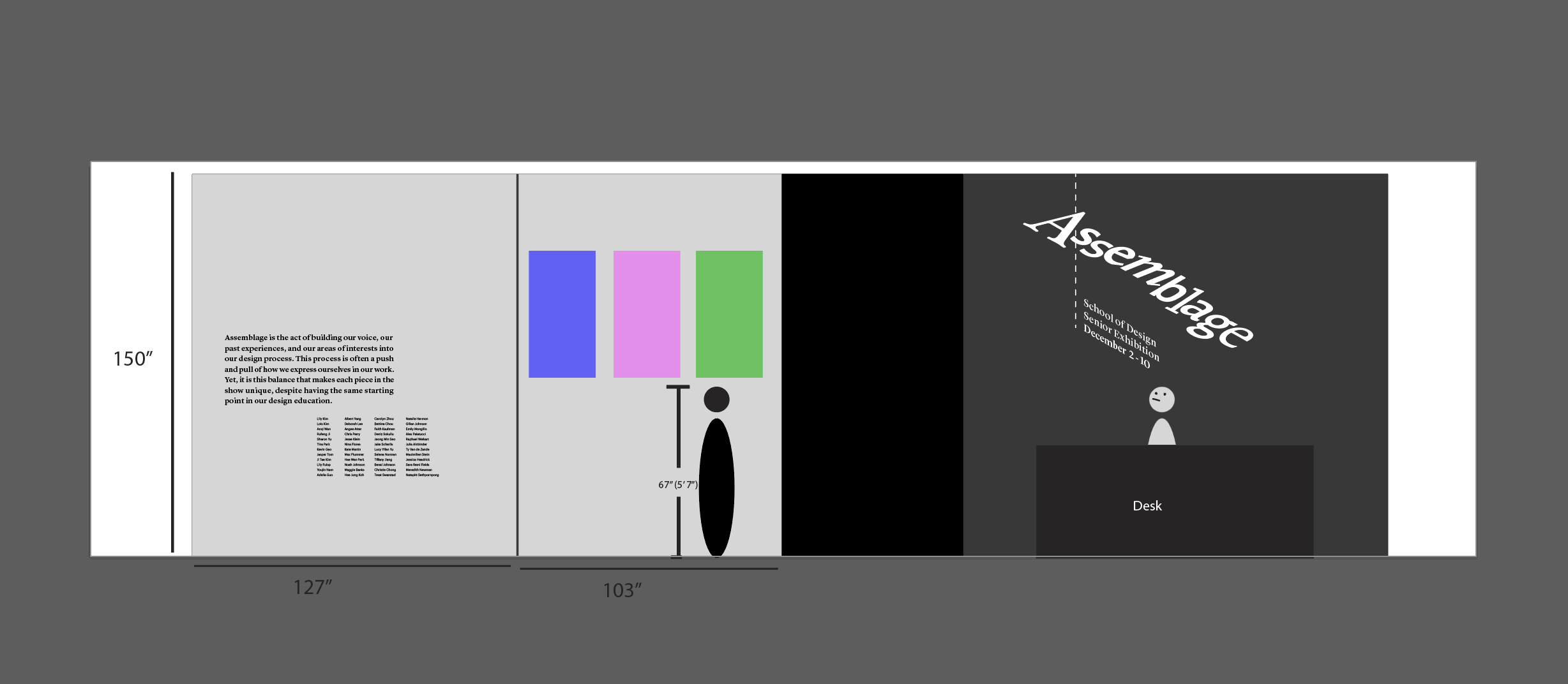
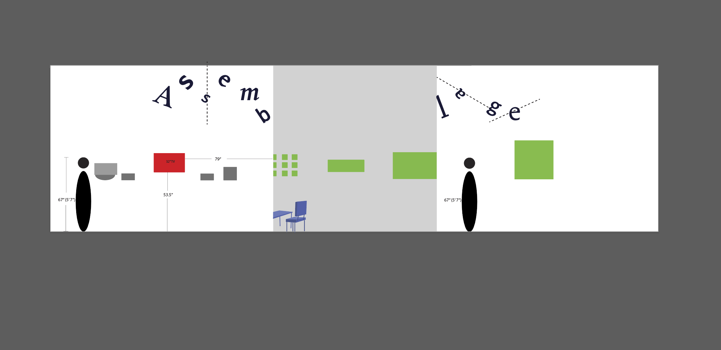
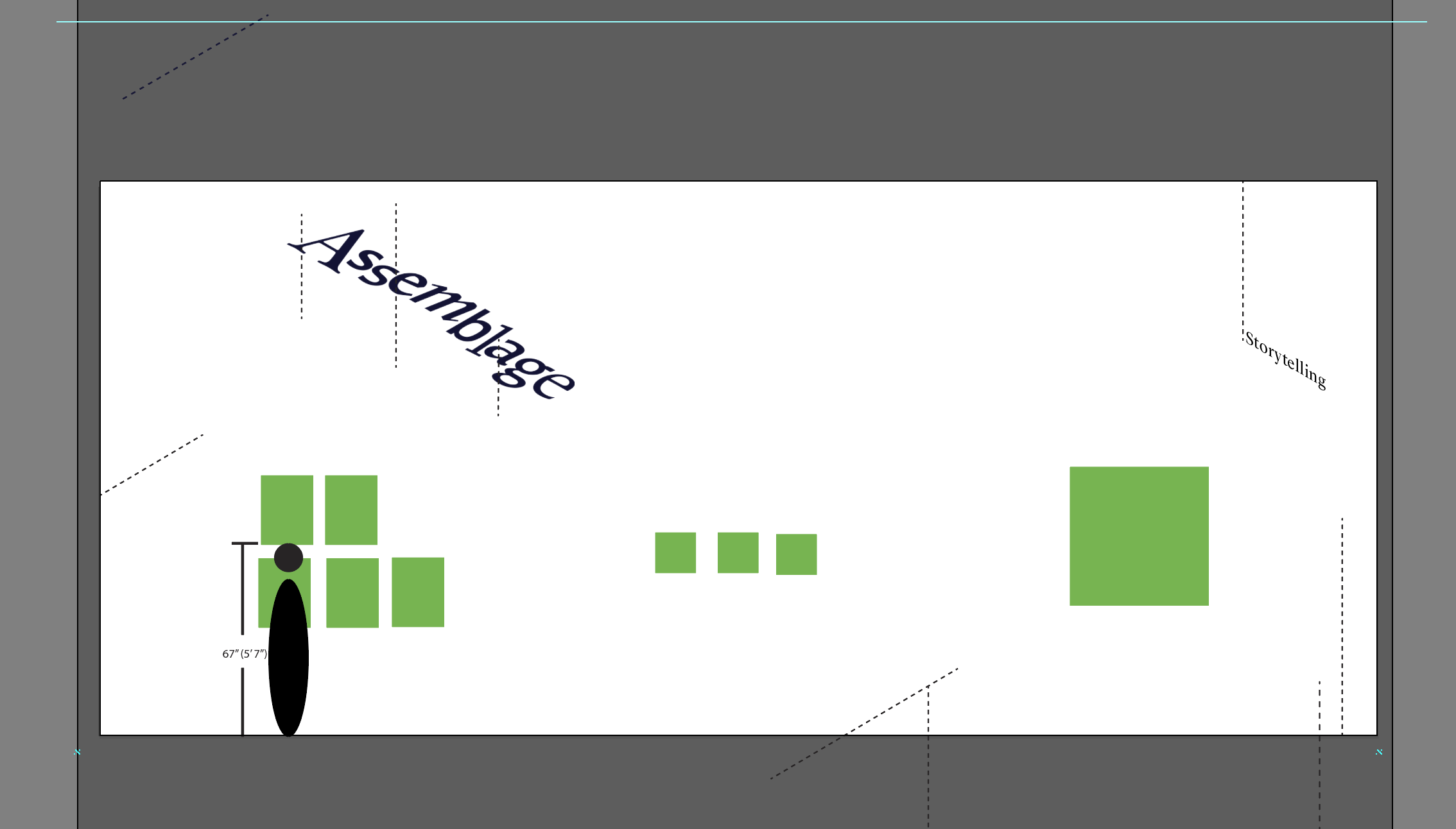
I got dimensions from the Curation team, and laid out the designs proportionally. I worked with my professor, Dylan, to print the vinyl correctly.
The whole branding team worked together to cut out the vinyl and install it on the walls.